Visualizing the size and scope of a library collection
This posting describes how I have begun to use Resource Description Framework (RDF) to visualize the size and scope of a library collection.
Library of study carrels
I have built a relatively small library of data sets which I call "study carrels". I denote these carrels as data sets because they are both machine-readable and computable. There are currently 169 carrels in my library.† Each carrel includes two or more items (articles, chapters, books, etc.), and each item is described using authors, titles, dates, extents, keywords/subjects, summaries, and identifiers. There are about 90,000 items in the library. Thus, each carrel is not only a data set, but each carrel is also a collection, and on average, each carrel includes about 500 bibliographic items.
Counting and tabulating
In an effort to practice the principles of linked data, I created RDF/XML files describing each carrel, and my canonical example of such a file describes the books/chapters of Homer's Iliad and Odyssey. Since I have 169 carrels, I have 169 RDF/XML files, and I uploaded them into a triple store -- a sort of database, specifically, Jena/Fuseki. I can then run reports against the triple store using a query language called SPARQL. For example, the following query counts and tabulates the frequency of each of the carrels' subject terms:
    # count & tabulate subject terms
    PREFIX carrel: <https://distantreader.org/carrel#>
    PREFIX terms:  <http://purl.org/dc/terms#>
    PREFIX rdfs:   <http://www.w3.org/2000/01/rdf-schema#>

    SELECT ?label (COUNT(?label) AS ?c)
    WHERE {
        ?s       a             carrel:carrel .
        ?s       terms:subject ?subject      .
        ?subject rdfs:label    ?label        .
    }
    GROUP BY ?label ORDER BY DESC(?c)
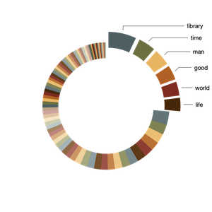
Like the results of an SQL query, this query's results are in the form of a matrix which I can import into any spreadsheet application, and in turn, visualize. Thus, from the pie chart below, you can see there are about 100 subject terms used to describe the carrels, and 25% of the carrels are described with only six terms: 1) library, 2) time, 3) man, 4) good, 5) world, and 6) life:
Identifying associations
I then asked myself the question, "How can I visualize the names of the carrels and their associated subject terms?" To address the question, I queried the triple store again, but this time, instead of outputting a matrix, I output a network graph -- a set of nodes and edges -- in the form of an RDF file. Here is the SPARQL query:
    # create a graph of carrels and subject terms
    PREFIX carrel: <https://distantreader.org/carrel#>
    PREFIX terms:  <http://purl.org/dc/terms#>
    PREFIX rdfs:   <http://www.w3.org/2000/01/rdf-schema#>

    CONSTRUCT { ?carrel carrel:about ?terms }
    WHERE {
        ?carrel  a             carrel:carrel .
        ?carrel  terms:subject ?qnumber      .
        ?qnumber rdfs:label    ?terms        .
    }
This resulted in a tiny subset of my original triple store. Using two different Python libraries (rdflib and networkx), I converted the RDF/XML into a file format called Graph Modeling Language (GML), opened the result in a graph analyzer/visualizer (Gephi), and addressed my question.
The visualization below illustrates the results. More specifically, orange-ish nodes denote subject terms, and by hovering over them I highlight their associated carrels. Conversely, blue-ish nodes denote study carrels, and by hovering over them I can see their associated terms. For example, the carrel named "dial" is associated with the greatest number of subject terms, and the subject "library" is associated with the greatest number of carrels. Put another way, "dial" is the most diverse of the carrels, and "library" is the most frequently used subject term. In the end, the visualization tells me what is in my library, how the things are described, and as a bonus, to what degree:
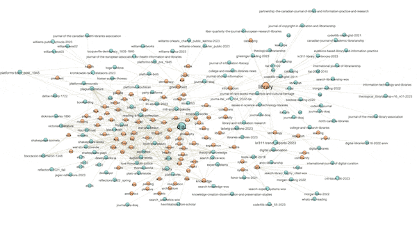
(View the image at full scale.)
Network graphs possess many mathematical properties enabling the student, researcher, or scholar to describe a graph's characteristics as well as identify patterns and anomalies. Rudimentary properties include the number of nodes, the number of edges, and the ratio between the two. Such is called "density". Dense networks are difficult to visualize, especially on a small canvas. Nodes have "degrees", meaning the number of edges associated with them. Scaling the sizes of nodes based on degree is illustrative. Graphs have "diameters", meaning the longest distance between any two nodes, and after the diameter is computed one can learn about a node's "betweeness", which is a more nuanced form of degree. Above (and below) I have scaled the sizes of the nodes based on their betweeness values, and you can then literally see how the scale of the nodes is similar to the frequencies illustrated in the pie chart. For example, the term "library" is the biggest subject node in both visualizations.
Another property of graphs is "modularity" -- a form of clustering. Think topic modeling for graphs. Once modularity is computed, nodes will coalesce into groups or neighborhoods of similar items, and in the end, this is another way to visualize the aboutness of my collection. After computing modularity against my graph, eleven communities were detected, and the nodes were assigned different colors accordingly. I can then turn off and turn on different communities to see their centrality, how they overlap, and to give them labels. In my case, there are four distinct communities and I call them humanities, art, library, and data. The balance of the communities are difficult to label. The illustration below shows some of the communities that exist and how they are related:
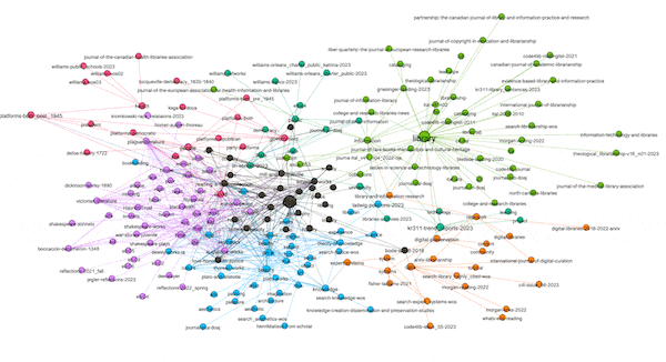
(View the image at full scale.)
Summary and next steps
In this blog posting I set out to address the question, "What are the things in my library about?", and I believe I accurately addressed the question. They are more about the arts than they are about the sciences. I am also able to give examples. Moreover, I am able to offer reproducible methods backing up my claims. These methods are not rocket surgery, but they do require shifts in the traditional analysis mindset, and they do require practice. Once embraced, these same methods can be applied to any set of MARC records extracted from any library catalog, and then the same question could be adressed.
For me, the next steps are many-fold. They include: creating additional carrels, enhancing my bibliographic description through the use of a more robust RDF ontology, making my triple store accessible on the Web, and ultimately practicing librarianship as it is being manifested in our globally networked environment. Wish me luck.
Footnote
† Actually, I have build another set of more than 3,000 carrels which I call "legacy carrels", and sometime in the future, I'll get around to including them in the library too.
Creator: Eric Lease Morgan <emorgan@nd.edu>
Source: This is the initial publication of this posting.
Date created: 2023-05-03
Date updated: 2023-05-03
Subject(s): RDF; linked data; library collections;
URL: https://distantreader.org/blog/visualizing-collections/