
I was delighted to speak at Data Science by Design’s Creator Conference. DSxD is a community of researchers, educators, artists, computer scientists who conference organizers described as curious, dynamic, creative and interdisciplinary. I chose to talk about the challenge of communicating about diversity metrics in a way that informs and inspires your audience to want to push for change using Mozilla’s last external diversity disclosure as an example.
Here are 3 important things to keep in mind when storytelling using data:
- Understand who your audience is
- Share the context of the data with your audience
- Think about how you want your audience to feel (and what you want them to do) after seeing the data
Audience
As this was an external disclosure it is obvious that one audience was people outside Mozilla. Transparency about DEI metrics is table stakes for companies that say they care about these things. It’s also an important part of a company’s employer brand, especially for younger workers. When I’ve been interested in a job, I’m checking to see if companies are sharing their diversity metrics, what photos they use to illustrate who works there, what diversity in senior leadership looks like and how they’re telling the story of what their culture is like. When I see stories of free beer Fridays, ping pong tables and “a work hard play hard” culture, I am much less interested in applying. I don’t drink alcohol, I don’t like ping pong, and I value work-life balance.
Equally important to me was the internal audience at Mozilla. We had done a lot of internal systems work including redesigning our hiring process, removing meritocracy from our governance and leadership structures, and improving accessibility internally by live captioning all company meetings being more intentional about accessibility at events. I wanted people to see that all of these projects laddered up to measurable change. I wanted them to see progress and feel proud of all of our hard work.
Context
A few years ago this is something I would have said:
By the end of 2019, representation of women in technical roles was 21.6%.
This would prompt many questions from people, including:
- Is this any good?
- How do we compare to other companies?
- How do we compare to the labor market?
- What does our pipeline look like?
- Are we getting better or worse?
- What do you mean by technical role? Is a data analyst a technical role? What about a data scientist?
Context is so important!
I decided to add an explainer video to the disclosure to help people understand the context. In addition, the video starts with the big picture context on why we were invested in D&I at Mozilla:
- from the the individual experience of feeling like you belong
- to being directly connected to the mission “to make the internet open and accessible for all”
- as well as the business case on innovation and performance.
Emotion
Taking a data-driven approach is necessary in an engineering organization–most people want to see and understand the numbers. For the last diversity disclosure I prepared, I saw the opportunity to try and tell a story that could connect to people’s heads and hearts.

I wanted them to feel something, whether that was pride at the progress we’d made, or frustration that we weren’t making change quickly enough. My ideal outcome was to pique people’s curiosity and have them ask “what can I do to make Mozilla a diverse and inclusive inclusive place?”. My worst case scenario is that people heard this update and thought “meh, whatever”.
Here’s the 3 minute video:
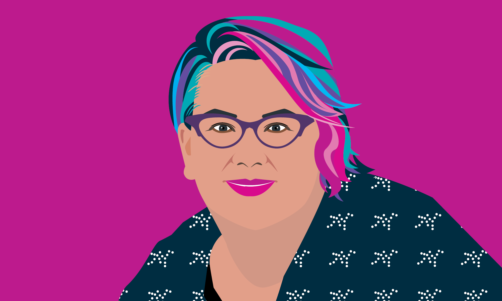
Drew Merit is the illustrator who brought this idea to life.
I’d love examples from your work, or examples that you’ve seen out in the wild where people have used data to tell a story that inspires the audience to take action.