Web Librarians Who Do UX: Access presentation

This is the text (approximately) of my presentation from the virtual Access conference on Oct.19, 2020, “Web librarians who do UX: We are so sad, we are so very very sad.”

Last year, I was doing interviews with library people who do User Experience work and noticed that people who were primarily focused on the web had the most negative comments and fewest positive comments overall. It made me think of the song from Scott Pilgrim—the comic and the movie—“I am so sad, I am so very very sad.”

So there’s the title.  And I’m saying “We are so sad” because I am also a web person who does UX work. And a lot of what I heard seemed familiar.

I want to say that although the title and the visuals are based around a comic and comic book movie, I’m not trying to be flip. A lot of the people who I talked to were very open about being unhappy. Not everyone was unhappy. But, there was a lot in common among the people who said they were struggling and those who were pretty positive. Here are some quotes from people who were generally pretty positive :

  • “How much can I do that no one will block me from doing?”
  • “Why am I really here then, if I’m just moving things around the page?”
  •  [I keep feedback] “for promotion purposes but also not-being-sad purposes.”

And from the not-so-positive :

  • “You have all the people who have their own personal opinions… and you’re like “you’re violating every good norm of website development”… they think their opinion is just as good as anyone else’s opinion. … That can definitely demoralize you.”
  • “I bounce back and forth between, for my own sanity’s sake, needing to be apathetic about it, saying ‘I can’t change this therefore I can’t be stressed about it’, and also on the other hand, caring that we have crappy stuff out there and wanting to improve it.”
  • “It is what it is. There’s lots of other things to be disappointed by.”

Heartbreaking, right? So why is this the case?

First  a tiny bit of background on the research project. The aim of the project was to look at how UX work is structured and supported in academic libraries and then to examine those supports within the context of the structures. I did hour-long semi-structured interviews with 30 people in academic libraries from 5 countries (Canada, the US, the UK, Sweden, and Norway). These were library workers who do UX, so not necessarily librarians, and not necessarily people in UX positions. The people I’m talking about today focus mostly on the web in their jobs.

The frustrations of web folks were particularly  striking because I didn’t ask a question about frustrations; I asked what supports were helpful to them and what would be helpful. Admittedly, asking “what would be helpful” is going to bring up deficiencies, but I didn’t ask what supports were missing or what they found frustrating in their work. And again, the web folks talked more about frustrations and difficulties than participants who didn’t have a web focus.

So let’s dig in a bit. Why, specifically, are we so sad?

First off, we have a tendency to want to think big! Do more!

  • “That’s what motivates me—the opportunity to really sit down, talk, observe, have a conversation with our users, how they approach the website, how they approach the research process, how they approach finding out about our services and how we in turn can better highlight our resources, how we can better highlight our collections, our services.”
  •  “If I see people struggling with things, I want to make them better.”
  • “I don’t want UX to be just a website thing. I don’t want people to think of it ‘oh, it’s just a web thing.’ I want it to be in everything.”
  • “I just see lots of potential all the time. I see potential everywhere, the whole library. I see things we could do that would enhance things.”

That doesn’t sound sad. There’s energy and excitement in those words!

But contrast it with:

  • “Why am I really here then, if I’m just moving things around the page? I’m trying to get deeper. I’m trying to get a better understanding. It’s not just a matter of moving things around.”

Web people who do UX are, I think, well positioned—and perhaps uniquely positioned—to see big picture problems across the library. One participant told me they found that users were confused about the Circulation section of the website because there were 18 different policies underlying it; they could rewrite the web content but couldn’t do anything about the underlying spaghetti of policies. Another said that users found the floor maps confusing but the maps reflected the language used on the library’s signage; they could put clear language on the website’s floor maps but couldn’t do anything about the signage in the building.

So we see these problems and naturally want to solve them. We get excited about the potential to make more things better. And we chafe against having to think smaller and do less.

Which brings us to: lack of authority. Lack of authority often comes up around those larger library issues. One participant put it this way:

  • “The UX work is actually informing something else to happen. Whether that’s a space being reorganized or a webpage being redesigned—the UX work is informing this other work. Right? So it would be easier for me to do the UX work if I could actually do the work that it’s informing.”
  • Another person was even having problems at the research stage: [I’d like to] “have the authority and freedom to actively engage with users.”
  • And someone else, in talking specifically about their web work said: “Nobody tries to stop me.” The implication being that people try to stop them when they do other things.

But for many participants there was a lack of authority even when dealing with the library website:

  • “The web team doesn’t feel like they can really make changes without consult, consult, consult with everybody even though – even if, and even though – the web team has web expertise.”
  •  “Just because I’m our internal expert on this stuff doesn’t mean I can persuade everybody.”
  • “There’s too much of a sense that these things have to be decided by consensus”
  • “Everyone feels… like they should have the right to declare how databases should work, how links should be configured, things like that.”
  • [Each library unit feels] “they have the right to do whatever they want with their content and their presentation. … I’m not their boss and they realize that.  I’m happy to draw up more guidelines and stuff like that but if I’m not allowed to enforce that… [it’s] hard to keep things together when you just have to go hat in hand to people and say ‘pretty please, stop breaking the guidelines.’”

One participant described how having no authority for the one thing they were responsible for made them feel: “Of course that has stymied my initiative, not to mention my disposition. My purpose even.”

Another frustration that came through was resistance from colleagues. A few comments have already touched on colleagues ignoring expertise but resistance comes through in other ways

  • One participant described how they always approach a particular department: [I’m] “treading very slowly and carefully and choosing my words very carefully”
  • Another said: “Are they deliberately killing the idea but trying to avoid being disagreeable about it but just letting it die from attrition, or do they really actually mean it when they say they agree with the idea in principle but just don’t want to be bothered to follow through? I don’t know – I can’t tell the difference.”

These are things participants were told by their colleagues:

  • A manager said that “staff felt unfairly targeted” by their work
  • In opposing to changes to the website: “We have to keep it this way because we teach it this way”
  • And similarly, “It’s our job to teach people how to use, not our job to make it easier to use.”

So, not surprisingly, these kinds of things make us feel isolated. Feelings of isolation come through in a few ways. Some participants felt they were completely on their own when deciding where to focus their attention. This is one participant talking about being new in their position:

  • “I remember asking for, if there were any focuses they wanted to focus on… they said ‘no, there’s nothing. We don’t have any direction for you to go in.”

That lack of direction is often coupled with not having colleagues who do the same work:

  • “It’s really me and up to me to figure out where to focus my attention by myself. So sometimes having someone to bounce ideas off of and talk things through with… would be nice.”

And when no one else does what you do:

  • “Sometimes that’s a barrier, if I’m the ‘expert’ and other people don’t really know what I’m talking about.”

So, isolation, having to think small and do less, resistance from colleagues, and lack of authority. Yeah, no wonder we feel a bit sad.

What are my take-aways?

We need to find our people. UX folks who worked with groups of colleagues were more positive about their work. However, people who tried to do UX work with non-UX committees were even more negative than people who had no group at all. So we can’t just look for any people, they have to be the right people.

I wrote an article about the larger project that was published in Weave earlier this month and in it, one of my recommendations was to try to move beyond the website. But I want to say here that moving beyond the web is not a panacea. I talked to someone who had great success in UX for the website and other digital projects. They wanted to embed UX throughout the library and they had management support to do it. But after continued resistance from colleagues, they realized they couldn’t make it work, and decided to move to a completely different area of the library. Which brings me to my next point.

Advocacy is important, absolutely, but when we’re not getting buy-in, we need look at next steps: do we need to change our tactics? Would it be better to have someone else advocate on our behalf? Do we need to wait for a change of leadership? Or, as a few participants said, a few retirements? At a certain point, do we give up, or do we get out? Because advocacy doesn’t always work. And if it’s not working , we shouldn’t keep banging our heads against the post, right?

Ultimately , I think we need to be clear about authority.

We need to understand how authority works in our own library. Not just who can block us and who can help, but are there organizational structures that confer some authority? Is it better to chair a committee or a working group? For example.

Then, we need a clear understanding of what our own authority is within our organization. Maybe we underestimate the authority we have. Maybe not. But we need to be clear before we get to the next part.

Which is: we need to clearly understand our own tolerance for doing work that will never be acted on. The report that sits in a drawer. If our tolerance is low, if it’s upsetting to have our work ignored, then we need to stick very closely to our own sphere of authority. We have to dream within that sphere or burn out.

“Dream small or burn out” is an exceptionally grim note to end on.  But these frustrations are largely beyond one person’s control. If you’re feeling so very very sad because of some of these things, IT’S NOT JUST YOU. The fact that these issues were common to web folks, regardless of how they seemed to feel about their work, suggests that these positions are prone to these kinds of frustrations.

I wish I had some ideas for how to fix it! If you do,  please add them to the chat, tweet at me, email me (see contact info). I’ll gather it all in a blog post so it’s all in one spot. Thanks.

Sponsored Post Learn from the experts: Create a successful blog with our brand new courseThe WordPress.com Blog

WordPress.com is excited to announce our newest offering: a course just for beginning bloggers where you’ll learn everything you need to know about blogging from the most trusted experts in the industry. We have helped millions of blogs get up and running, we know what works, and we want you to to know everything we know. This course provides all the fundamental skills and inspiration you need to get your blog started, an interactive community forum, and content updated annually.

The TPL Debacle: Values vs People

I can’t stop thinking about the situation at TPL. The short version is that the library has accepted a room rental from an anti-trans speaker, and despite outcry from trans people and their allies, despite a petition and a boycott by writers, despite their own policy on room rentals not allowing events that promote discrimination, they insist on letting the event proceed. Some library associations are supporting them because librarians love being Champions of Intellectual Freedom.

Many people have made cogent arguments about why TPL’s stance is wrong (see posts by Fobazi Ettarh, Sam Popowich, Kris Joseph). I agree. But there seemed to be more of a reason why the whole thing made me so sad. I’m writing because I think I’ve figured it out.

In its two public statements on the matter, TPL has made sure to say that they “are supporters of the LGBTQ2S+ community.” They “are aware that the upcoming room rental event has caused anger and concern.” But the “community is asking us to censor someone because of the beliefs they hold and to restrict a group’s right to equitably access public space and we cannot do either. Doing so would also weaken our ability to protect others’ rights to the same in the future.” Fine.

But they also said “While TPL encourages public debate and discussion about differing ideas, we also encourage those with opposing or conflicting viewpoints to respectfully challenge each other’s ideas and not the library’s democratic mandate to provide space for both.” That doesn’t sound super supportive. And at the board meeting held on October 22 where the matter was discussed, it was clear they were more concerned with a respectful tone than with actually listening and understanding. Reading how the trans women who spoke at that meeting felt about how they were treated was heartbreaking.


It does not sound like these women were talking to “supporters” of their community.

And that is what’s making me extra sad about the whole thing. Not only is TPL choosing to value intellectual freedom more than they value trans people in their community, they are choosing to value intellectual freedom instead of valuing trans people in their community.

It is not incompatible with upholding intellectual freedom to also acknowledge that it’s doing harm. TPL could reach out to the community and say “we know this event makes trans people feel unsafe. But we’re convinced that not allowing it to go forward will set a precedent for future decisions to shut down other events, possibly those that actively support trans people, and we cannot let that happen. We understand that this event will cause harm and undermine our relationships with LGBTQ2S+ people and your allies. What can we do to mitigate this harm?”

It’s not as good as cancelling the event entirely, but at least it would show that TPL has been listening to its community. It would show that they have thought through the consequences of choosing values over people. It would show that they are not just “aware” of “anger and concern” but they understand the fears, risks, and harm their actions are causing. And of course, the community would have every right to tell them, no, there is nothing you can do to mitigate this harm. But that doesn’t mean TPL shouldn’t try. To not just say “we uphold intellectual freedom,” but to acknowledge exactly what that means in this particular case.

I’m reminded of the saying that goes something like “your right to swing your arm ends when your fist meets my face.” TPL is insisting that they have the right to keep swinging. Fine. But they have been told that their fist has already met the face of the trans community. The compassionate thing would be to offer first aid.

But TPL is not interested. Which, sadly, speaks volumes. It makes it crystal clear that they do not care about the trans community. It makes it crystal clear that they believe that the trans community and its allies are dispensable to their operations. The consequences of their decision (or, to be fair, their decision not to make a decision) are acceptable collateral damage; they are happy to make no attempt to mitigate any of it. If they really were supporters of the LGBTQ2S+ community, they would be supporting the LGBTQ2S+ community.

In a way, it’s not surprising that the trans community is the group that so many librarians are choosing to not care about. Being trans is simultaneously visible and invisible. A trans person may be visibly trans in that they do not present in the way that some might expect, but what makes them trans is inside them, not outside. What makes a person trans is in their heart and their mind. They know who they are *inside* in a way that cannot be seen by people who don’t know them (people who do know them can see how much happier they are when their outside gets closer to matching their inside). But to the outside eye, to the dispassionate eye, there is no evidence. And without evidence, their trans-ness can be seen as just a belief. And if it’s just a belief, well then, we can debate it. And we should debate it because, as librarians, we are Champions of Intellectual Freedom.

I so wish that we were champions of people instead.

Library Workers and Resilience: More Than Self-Care

An article in the Globe and Mail this spring about resilience was a breath of fresh air—no talk about “grit” or bootstraps or changing your own response to a situation. It was written by Michael Ungar, the Canada Research Chair in Child, Family, and Community Resilience at Dalhousie University and leader of the Resilience Research Centre there. The research shows that what’s around us is much more important than what’s inside us when it comes to dealing with stress.

The article was adapted from Ungar’s book, the now-published Change Your World: The Science of Resilience and the True Path to Success. I know, the title is a little cringey. And honestly, some of the book veers into self-help-style prose even as it decries the self-help industry. But on the whole, there is quite a lot that it interesting here. I was looking at it for an upcoming project on help-seeking, but it keeps coming to mind during discussions about self-care and burnout among library workers.

Ungar writes of the myth of the “rugged individual” who can persevere through their own determination and strength of character. We get fed a lot of stories about rugged individuals, but Ungar has found that when you look closely at them, what you find instead are “resourced individuals”—people who have support from the people and environment around them.

“Resilience is not a do-it-yourself endeavor. Striving for personal transformation will not make us better when our families, workplaces, communities, health care providers, and governments provide us with insufficient care and support.” (p.14)

Ungar is mostly focused on youth but also writes about workplaces, even though this is not his direct area of research. Two passages in particular caught my eye: “Every serious look at workplace stress has found that when we try and influence workers’ problems in isolation, little change happens. … Most telling, when individual solutions are promoted in workplaces where supervisors do not support their workers… resilience training may actually make matters worse, not better.” (p.109)

A now-removed article in School Library Journal explained how one library worker changed herself to deal with her burnout. The reaction to this article was swift and strong. Many of us know that individual stories of triumph over adversity are bullshit, particularly when we have seen those same efforts fail in our own contexts. I have found it validating to find research backs that up.

Ungar does allow that there are times when changing oneself can work—either a) when stress is manageable and we already have the resources (if you can afford to take two weeks off to go to a meditation retreat, why not), or b) when there is absolutely nothing else you can do to change your environment or circumstances (your job is terrible but you can’t leave it and you’ve tried to do what you can to improve things, so sure take some time to meditate at your desk to get you through your day). But most of us live somewhere between perfectly-resourced and completely hopeless. So what needs to be fixed is our environment, not ourselves.

I have noticed resilience has been coming up as a theme in my own university over the last year or so—workshops on becoming more resilient or fostering resilient employees. Ungar says “To be resilient is to find a place where we can be ourselves and be appreciated for the contributions that we make.” That’s not something individuals can do by themselves. People in leadership positions would do well to better understand the research behind resilience rather than the self-help inspired, grit-obsessed, bootstraps version. Workshops and other initiatives that focus on individuals will not fix anything. At best, they are resources for people who are already doing pretty well. At worst, they add to the burden of people already struggling by making them feel like their struggles are caused by their own insufficiency.

Anyway, these are just some thoughts based on a single book; I’m nowhere in the realm of knowledgeable on this subject. But I thought it might be helpful to share that there is research that backs up the lived experience of the many library workers who struggle in their organizations, despite their own best efforts.


Research projects: Call for help

I’m on a year-long sabbatical as of July 1 and excited to get started on a few different research projects. For two of the projects, I’m going to need some help from the UXLibs/LibUX community. In one of them, I want to look at love letters that users have written to academic libraries so I need people to send me love letters their users have written. In the other, I want to look at the different ways UX work is structured and supported in academic libraries so I need people who are willing to participate in an interview that will take around 60 minutes.

Do you want to know more? Read more about the love letters project. Or, read more about the UX work project.

I am happy to answer any and all questions: shelley.gullikson[at]carleton.ca or @shelley_gee on Twitter, or in the comments below. Thank you in advance for considering! And endless appreciation if you decide to help!

UXLibsV: Notes

uxlibsvFive years of UXLibs – hurrah! Let’s dive straight in.

Barriers to UX Design: Andy Priestner

Andy kicked off the conference with his address about why he thinks not many of us are moving beyond research reports when it comes to doing UX work in our libraries:

  1. We see research as the finish line. UX is about uncovering actionable insights, not about statistical significance
  2. We’re terrible at idea generation. We tend to get set on the first “safe” idea we come up with.
  3. We pursue perfection. Instead, we should evolve services with our users.
  4. We’re too cautious. After talking with library directors, Andy thinks library staff perceive less agency than we actually have; directors say they want their staff to try new things.
  5. We’re not agile enough. Not everyone needs to be consulted before we can take action.
  6. Issues around ownership and politics. There is uncertainty about where UX sits and the scope is misunderstood.
  7. Ignoring the basics. UX is often perceived as innovation (and institutions love innovation) but UX can also be sorting out the basics.
  8. Fear of failure. We overreact to negative comments. Failure is not modeled; we may hear that it’s okay to fail but we don’t tend to see it.

Andy then gave some examples of projects where libraries created prototypes out of their UX research, and iterated to improve the design to actually meet user needs.

Leadership is Key—My UX Journey: Anneli Friberg

Anneli gave a very warm and personal keynote, talking about her experiences growing UX at her library.

One of the things that stood out most for me was her explanation of how “the user perspective” is different from “the user’s perspective.” Library workers often feel they have “the user perspective” because they spend so much time serving users. But Anneli said that this “user perspective” is only ever the best guess of library workers, looking from the inside-out. “The user’s perspective” is outside-in; we walk along with our users to learn what they actually do, say, and feel. It’s not a guess.

friberg-slide
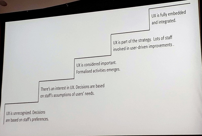
Anneli showed us her version of a UX maturity model (created in Swedish and translated into English). She talked about the importance of recognizing what kind of organization you work in and where you are in the maturity model. She spoke about the frustrations she encountered when her library was in the early stages of maturity and how it helped her to have an external network she could rely on for support.

To get through the frustration of the early stages of UX maturity, you have to shape the culture of your library. Anneli recommended leading this culture change by example.

Michael West has said “The core of leadership is compassion and kindness” and lays out four aspects of leadership: attending, understanding, empathizing, and helping. He describes “attending” as “listening with fascination,” which I really like as an idea. A few other interesting bits from Anneli’s keynote:

  • Failure is success in progress
  • Do idea generation together with your users
  • Take pictures of how students are using the library so you can easily show needs and gaps (e.g. a student hanging their coat on shelved books points to the need for coat hooks!)
  • Lead by clearing the path (help remove barriers for others)

Anneli had some interesting and useful things to say about failure. She believes that having a project fail was an important step in moving her UX vision forward. Her team did some research, found a problem, and wanted to try a solution. Anneli was pretty sure it wouldn’t work, but didn’t discourage them. They launched the solution and, sure enough, it didn’t work as well as they’d hoped. But having the experience of a failure, they were able to move on and try other things. They saw that failure wasn’t the end of the world, that the important thing was to try something, learn, and move on to try something else.

Neurodiversity, Universal Design and Secrets of the Library: Penny Andrews

Penny started her plenary talk by defining what neurodiversity is and is not. She then talked about how neurodiverse people experience the library. And often it’s not good.

Libraries have a lot of unwritten rules and unspoken social norms, and this is very challenging for neurodiverse students. Library staff often don’t want to be the police so we expect users to manage the space themselves. But this usually relies on those unspoken social norms. Clarity of the rules and enforcement of those rules would help neurodiverse students.

Silent study spaces can be difficult because they are never actually silent. It’s easier to hear things like people chewing and keyboards clacking in silent areas. But often, silent areas are where individual study spaces are found. Having individual spaces in non-silent areas could be helpful.

Penny told us that most neurodiverse students do not ask for individual accommodations, or else wait until their situation is completely unbearable. Autistic students are most likely to drop out within their first year. But if they continue, they tend to have the highest marks.

So, what can libraries do?

  • Be upfront with our information (not hide it under “Services for Disabled Students”). Library websites have so much information and no good way into it.
  • Related, be specific with our communications. Don’t just say “we’re here to help!” but make it clear how and why to make a one-on-one appointment.
  • Use universal design and consider various people’s needs from the start, not as an add-on. We can’t do one-size-fits-all because of competing needs, but our designs can account for these competing needs.
  • Don’t depend on Disability Services as a liaison. Not all students declare their disabilities so Disability Services won’t know what those students need.
  • Recruiting can be difficult. Talk to people in the library who look like they’re not having a good time. Go to special interest groups that might draw neurodiverse people (Penny recommended something geek-related). Regular recruiting methods often bring out the outliers who always want to join in and who don’t represent the majority of neurodiverse people.
  • Always go in assuming we know nothing. A little bit of knowledge (knowing one neurodiverse person) is worse than knowing nothing. Neurodiverse people are a diverse group.

After Penny’s presentation, someone asked her if there were certain UX research methods that neurodiverse people found difficult. Penny responded that ambiguous prompts—particularly things like “draw your research experience” or “build your ideal library”—tend to be difficult, as is anything with group work. Definitely good things to keep in mind.

Tales of the UneXpected: Hannah Fogg and Lorraine Noel

Both speakers talked about the experiences of having front-line staff engage in UX work at their libraries. Hannah started off with the experience at Angela Ruskin University (ARU).

At ARU, they didn’t want UX to be just for librarians, so they brought in Andy Priestner to do UX training for their frontline staff. As part of the training, the staff did mini UX projects using their newfound knowledge of UX research methods. Having “mini” projects was meant to not overwhelm some staff who might be scared off by a big project, and at the same time not give free rein to others who would be tempted to be too ambitious.

One of the projects Hannah highlighted was a mapping exercise that showed users completely avoiding the print journals shelving (they diverged to one side or the other), so a decision was made to move those shelves out of that area of the library entirely.

Lorraine was up next to talk about the experience at Huddersfield. They had seen what ARU had done and wanted to replicate it, in hopes of professionalizing their front-line staff and enhancing the user experience. Bryony Ramsden led the workshops for Huddersfield staff. Attendance was mandatory and they also had to work in groups on a “modest UX project.” Those groups had to include staff from at least two different areas of the library (I love that idea!), and each of the 10 groups had a manager as a “guide on the side.”

There were a lot of benefits to the Huddersfield experience, but Lorraine also mentioned that there was some initial resentment from staff, likely due to the mandatory nature of the project.

Hannah said that at ARU, staff appreciated learning skills in project management that could help with their career progression. Also, ARU lost their UX expert and staff were happy to feel empowered to carry on the UX work on their own.

Passionate About Floorplans: Tim Graves

(I was excited about this session because floorplans are the bane of my existence. We get a lot of requests to make them fancier or add functionality, but keeping them up to date is a constant struggle. I finally resigned myself to walking through our 5 floors three times a year, making any necessary corrections on printed versions of our maps so I can update the ones on the web. The maps posted in our building get updated by the campus facilities people and at times bear little resemblance to the web versions. ARGH!)

Anyway, Tim also wanted to improve the floorplans on the website of the University of Sussex. The library was receiving a lot of questions about how to find things in the library and Tim thought that better floorplans on the website might help people better navigate to what they needed.

First, he came up with a version based on printed floorplans, but they were too complex and not responsive on smaller screens. Inspired by the London Tube Map, he created a simplified version, but discovered it was *too* abstracted from reality to be useful. The “just right” solution came after he did a lot of reading in the design literature (especially Alberto Savoia and Jeanne Liedtka & Tim Ogilvie) and started iterating his design with users.

Tim mentioned the usefulness of “pretotyping” a solution to see if it’s worth getting to the prototyping stage. A pretotype is essentially a very rough, low-fi prototype. It might be a good thing to keep in mind if you work with people who find it difficult to create quick and dirty prototypes. You could say “we don’t need a prototype yet, let’s just pretotype it!” Even though *you* know a prototype can just be a rough sketch, they can think it’s a whole different (and new!) thing.

You can see Tim’s improved floorplans. And he said that he’s happy to share the code that drives them. You can contact Tim at t.c.graves[at]sussex.ac.uk.

Appreciative Inquiry Workshop: Kristin Meyer

Appreciative inquiry is a method that helps people focus on solutions instead of problems, leads groups to action, and does so in a very positive way. I was really excited about this workshop because anything that Kristin does always seems excellent. I was not disappointed.

The workshop started with an introduction to appreciative inquiry and then Kristin led us through a sped-up process of appreciate inquiry as we worked through an issue that’s been raised through UX research at her own library. The steps we took:

  1. Connect to purpose: Look at the big picture and why this problem is important. How could exploring this area benefit users?
  2. Frame it and flip it: Clearly state the problem so that everyone is on the same page. Then, think about the desired state instead of the problem and come up with a question to help us explore what we desire for our users.
  3. Dream of the ideal future: Think about words and phrases that describe an ideal solution. How will success look and feel?
  4. Ideate: We skipped this step in the workshop because it takes a lot of time. Kristin mentioned her favourite ideation technique is Brainwriting, described in the book Gamestorming (2010).
  5. Prototype internally: Our colleagues may have good ideas and asking them for feedback can help build early buy-in. Generative questions keep things positive: What do you like about this idea? How can we improve this idea?
  6. Prototype with users: Again, we skipped this step because we had no users to prototype with.

I liked step 2, where we flipped the problem into a desired state. I’m guessing that thinking of “what do we want to happen” instead of “what do we want to stop” could help avoid the “solution” of putting up a sign or trying to curb behaviour with punitive measures.

I also really like the idea of connecting to colleagues with generative questions, rather than asking for general feedback. Andy may have said that not everyone needs to be consulted, but sometimes it’s important or useful to consult our colleagues. Using generative questions would be a way to lessen the chances of hearing “that will never work” or “why don’t you do X instead?”

Advanced Interview Techniques: Danielle Cooper

Since I’m about to embark on a project that involves a lot of interviewing, I thought it made sense to make sure that I took advantage of any opportunity to improve my skills in this area.

Danielle has a lot of experience with interviewing users in her job at Ithaka S+R. The short version of this workshop is that the best way to get better at interviewing is to keep doing it, so we spent most of the time in groups of 3 taking turns being interviewer, interviewee, and observer. Danielle gave us some practical tips as well.

To probe for more information, from least obtrusive to most:

  • silence
  • non-verbal affirmation
  • echoing the response
  • affirmative neutral comments
  • repeating or clarifying the interview question
  • summarize and synthesize the answer
  • simply saying “tell me more”

If participants are not very forthcoming, you can try a variety of these probes. Be willing to cut your losses and end the interview if you’re not getting any useful information.

On the other hand, if participants are way too chatty, you can try the following:

  • gentle inattention
  • polite transitions
  • graceful interruptions

Working in Difficult Environments: Lessons from the World of Civic Design: Suzanne Chapman

Suzanne started her keynote with some examples of behaviour that many of us recognized from our workplaces. chapman-slide

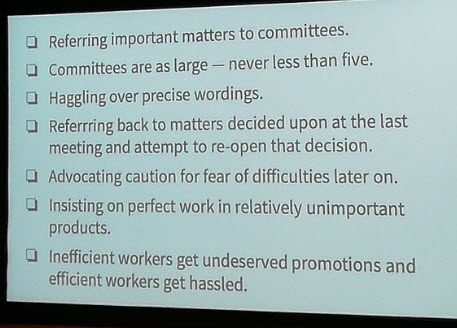
She then pointed out that these behaviours were from the Simple Sabotage Field Manual from the OSS (predecessor to the CIA), a document explaining to spies how to sabotage enemy organizations.

She gave a quotation from a senior person in one of the organizations she’d worked in: “We are trying to do as much end user testing as possible without actually talking to users.” Suzanne noted that UX maturity models, such as the one Anneli showed in her keynote, are missing the part where humans are difficult and sabotage-y.

She also noted that doing UX in libraries is extremely hard.

But this work can be made easier if everyone can agree on specific guiding principles. She shared seven that she uses at the Centre for Civic Design:

  1. Do the most good for the most people who need it the most (italics mine). This goes beyond the 80/20 rule and looks at need rather than just numbers.
  2. Delivery is the strategy. Given the choice between culture change and “getting shit done,” they have chosen to let culture change come second.
  3. Work lean, iterate quickly. Sometimes this means doing the least shitty thing, but it always means that you should only make *new* mistakes.
  4. We use design to make things better. Design means working your way through the problem in order to reach a solution, not just grabbing a solution.
  5. We design with users, not for them. This is similar to Anneli’s message to take the “user’s perspective” rather than the “user perspective.” Also, research is done with a goal of improvement, not just for learning.
  6. Hire and empower great people. And there has to be agreement about what it means to be empowered; there should not be responsibility without authority.

These principles may not resonate, or even be possible in your library. But going through the process of deciding what your library’s guiding principles are can be your anti-sabotage model.

My web committee went through this process, based on guiding principles Suzanne wrote while she was still working in libraries. The process was very helpful in making sure we really were on the same page. It’s also a useful document to show people coming on to the committee for the first time. It would definitely be *more* useful if it went beyond just our committee, but it’s something. If you’re interested, we’ve made our guiding principles public.

UXVR: The Potential of Virtual Reality to UX Research: Victor Alfson

Victor spoke about a project he did at the Black Mountain Library in Stockholm. He asked users to create a great library for themselves using a VR headset, Tilt Brush (a 3D-painting app), and a 3D model of the existing library. He asked participants to narrate their actions, but also jumped in with questions.

It’s a similar task to what you could do with pen and paper, but using VR gave a different angle. To recruit participants, Victor asked the (possibly slighty creepy) question, “Do you want to come down to the basement to try something cool?” 9/10 people that he asked agreed to participate! And once they were there, they stayed—for 40 minutes on average— because the task was novel and engaging.

Victor found that participants were very candid in what they said, and he wondered if that was due to people feeling like they were in a private space. With the VR headset on, they were alone in the 3D library space, with Victor’s disembodied voice occasionally asking them questions.

So what did users draw and talk about? Well, it was the usual things: food, noise, finding the right kind of space. But the insights were interesting. A few kids drew a McDonalds in the library, and went on to say that they just wanted to be able to eat their snack without a librarian bugging them. One kid drew a vortex in the library that would take them directly to their home. Victor asked further about this and found out that this kid had to take two buses and the metro to get home from the library. I wondered if this kind of thing would have come out in a pen-and-paper exercise, or if it was the technology that made the kid think about an amazing technological solution to their transportation problem.

Overall, Victor said that it was very fun research for both him and the participants. And his library will be following up on some of the insights they gained, such as creating a new quiet study room for kids working on their homework. Previously, these kids tried to find quiet nooks and crannies to work in, so both they and their needs were unseen by library staff. Victor’s project brought them out of their quiet corners and gave them a new space of their own. A nice real-world result for this VR project.

Internships and Ethnography: Students Researching Students: Claire Browne

Claire spoke about using a student intern to carry out a UX project using a cultural probe to get to know the needs of taught postgraduate students at the University of Birmingham. The university’s Careers department was looking for meaningful student placements that showcased careers in higher education and gave students experience with project management and data analysis. It was a great fit with the library’s desire to expand their UX work.

Before the intern was hired, the library had to have the project go through ethics review and recruit participants (10 in total). They had ideas for what they wanted in the cultural probe, but the intern, Luke, was able to put his stamp on it, finalizing the tasks and adding notes and jokes to the participant diaries to keep their engagement up throughout the 2 weeks of daily tasks.

Some of the tasks were: answering specific questions, writing a letter with advice to a student starting out, card sorting, a photo study showing their typical day, a love letter/break-up letter, and a cognitive map.

All participants did every task, which seems to show that Luke did a great job keeping everyone engaged. Participants enjoyed the variety of tasks and provided a lot of rich information in the self-reflective tasks.

Luke gave a presentation to senior staff about his findings and they were very engaged with this 17 year old telling them about the problems in their library. I want to know more about this; were they more engaged because he was an “outsider,” because he was a student, because he was young? Related, Claire mentioned that one of the benefits of having a student intern on this project was that he was not influenced by restraints or constraints felt by library staff; he saw only the user side.

Another benefit Claire mentioned was that Luke was able to engage with the student participants in a natural and informal way that she didn’t think would be possible for librarians. She thought the librarians would have been too formal or crossed the line into “cringey.”

If you want to know more, Luke wrote a report about the project and the techniques that were used in the cultural probe.

Love at First Sight: Consolidating First Impressions: Debbie Phillips

Debbie also spoke about doing a cultural probe, this time at Royal Holloway and focused on the experience of new students in their first weeks on campus. The focus was not entirely on the library, as the project was a collaboration among the library, Campus Life, and Internal Communications.

The Campus Life team were able to help with recruitment and 23 students agreed to participate, though only 13 actually finished all the tasks. Still, since they were hoping for 8 participants, this was a good result.

I was struck that, like Claire, Debbie said they were “hoping for a good mix” of participants. Both projects got a reasonable mix but missed out on representation from one or two groups. I think we often do generic recruitment when we want a mix, assuming that we should recruit from a wide group to get a wide range of participants. But if we want, for example, mature students or international students as part of the participant group, we really need to recruit them specifically in order to make sure of it. (I believe Claire did make this point as something they would do differently next time.)

Some of the tasks in the cultural probe at Royal Holloway: diary questions (2 questions from each of the 3 teams plus some general ones), photo tasks, postcard to friends/family (participants could ask for it to be posted but no one did), campus map with emoji stickers to indicate how they felt about specific buildings or areas of campus.

The library found they were surprised at how many students came to the library during their first visit to campus. They were also surprised at how few students attended their library induction. So, they’re planning to try to find ways to help students learn more about the library during that first campus visit, rather than waiting for induction.

Related, they also found that students expressed a preference for learning about campus prior to arrival, so the library will increase their communications ahead of Arrivals Week, rather than waiting until students are actually on campus.

Final Thoughts

I usually do a full post about my thoughts on the conference, but I don’t have a lot more to say. I had an amazing time, as usual, thanks to the wonderful group of people who come to this conference. In my professional life, UXLibs is my very favourite place.

I’m about to head off on sabbatical (maybe you can help with some of my projects!), so I’m not going to immediately apply much of what I learned but I am already excited to do that when my leave is over. I realize that I’ve been emphasizing the research part of UX because research is actually part of my job description and, outside of the website, design and prototyping is not. I felt comfortable doing research beyond the scope of the website, but not finding a way to move that research into action. When I get back to work I hope I can figure out how to, as both keynotes exhorted: get shit done.

Website Refresh: First Round of Iterative Testing

As I mentioned in my last post, we’re doing a design refresh of our library website, with a goal to make it “beautiful.” As such, we’re not touching much of the organization. But of course we have to pay attention to not just how the information is categorized but also where it appears on the page. We learned that a few years back when we tried adding a “Spotlight” feature near our Library Hours (tl;dr: people stopped being able to see the Hours when other content shared the space). So we are firm believers that user testing and iterative design is vital in making sure we don’t make parts of our site invisible by moving elements around.

After the results of our user research earlier in the fall, we came up with a design drawn from the sites that our users liked most that also worked within our current site structure. The layout was essentially the same, with three major changes:

  • We pulled “Quick Links” out of the menu and put it in a box on the front page
  • Hours moved from a box on the side to a banner under the search box
  • Our Help and Chat button also moved to this banner

We wanted to do user testing to make sure that users could:

  • find today’s hours
  • get to the full set of hours
  • figure out how to access help or chat.

We also asked them if there was anything they hated about the draft design. Just to flag anything that could cause problems but that we weren’t specifically asking about.

Since we were doing this testing early in the process, we didn’t have a live site to show. Our Web Developer, the fabulous Kevin Bowrin, built the mockup in Drupal since he’s more comfortable in Drupal than in PhotoShop, but it wasn’t on a public server. So we used a printed screenshot for this round of testing.

The first version of the design had a grey banner and small text and it was clear after talking to a few users that visibility was a problem. We only talked to 4 people, but only 2 saw the Hours and they were really squinting to make it out. Finding when the library is open should be really really easy. We decided to increase the text size and remove the grey background.

Hours and chat button in grey
Version 1

This time, even fewer people saw the hours: 1 out 6. Since people didn’t see today’s hours, we couldn’t even get to the part where we tested whether they knew how to access the full set of hours. We decided to see if adding an “All Hours →” link would help; perhaps by echoing the convention of the “View More →” links in other parts of the page, it would be clearer that this section was part of the content.

Nope.

Hours and chat button in white banner below Search box
Version 3

Again, quite quickly we saw that this section remained invisible. Only 1 person in 5 saw it. One user noticed it later on and said that he’d thought that part of the website was just a heading so he ignored it. Clearly, something was making people’s eyes just skip over this part of the website. We needed another approach.

Kevin and I talked about a few options. We decided to try making the section more visible by having Library Hours, Help and Chat, and Quick Links all there. Kevin tweeted at me after I’d left for the day: “Just dropped the latest iteration on your desk. I kinda hate it, but we’ll see what the patrons have to say!” I had a look the next morning. I also hated it. No point in even testing that one!

Hours, chat button, and Quick Links all part of Search box area
A blurry photo of the hated, not-tested version 4

We decided to put Hours where the Quick Links box was, to see if that would be more visible. We moved chat down, trying to mimic the chat call-out button on the McMaster Library website. Quick Links were removed completely. We have some ideas, but they were never a vital part of the site so we can play with them later.

Success! Most of the people we talked to saw the Hours and almost all of them could get from there to the full set of hours. (I did this round of testing without a note-taker, thinking I could keep good enough track. “Good enough?” Yes. Actual numbers? No.) The downside was that most people didn’t notice the Help and Chat link (not pictured here). However, I think we’ll really need to test that when we can show the site on a screen that people can interact with. The “always visible” nature of that button is hard to replicate with a print-out. I feel like we’re in a good enough place that we can start building this as more than just a mock-up.

Oh, and no one we talked to hated anything about the design. A low bar perhaps, but I’m happy that we cleared it.

Hours beside Search box
Version 5

We did all of this in one week, over 4 afternoons. For version 3, Kevin just added text to the screenshot so we could get it in front of people faster. Quick iterating and testing is such a great process if you can make it work.

Next steps: menu interactions and interior pages.

User Research: Beautiful Websites?

My University Librarian has asked for a refresh of the library website. He is primarily concerned with the visual design; although he thinks the site meets the practical needs of our users, he would like it to be “beautiful” as well. Eep! I’m not a visual designer. I was a little unsure how to even begin.

I decided to attack this the way we attack other problems: user research! Web Committee created a set of Guiding Principles a few years back (based on Suzanne Chapman’s document). Number one in that list is “Start with user needs & build in assessment” so even though I was having difficulty wrapping my head around a beautiful website as a user need, it made sense to move forward as if it were.

Background

How does one assess a beautiful website? I looked at a whole bunch of library websites to see which stood out as particularly beautiful and then discern what it was that made them so. Let me tell you, “beautiful” is not a word that immediately leaps to mind when I look at library websites. But then I came across one site that made me give a little exclamation of disgust (no, I won’t tell you which one). It was busy, the colours clashed garishly, and it made me want to click away instantly—ugh! Well. We might not be able to design a site that people find beautiful but surely we can design something that doesn’t make people feel disgusted.

I had an idea then to show users a few different websites and ask them how they felt about the sites. Beauty can mean different things to different people, but it does conjure a positive feeling. Coming up with feeling words can be difficult for people, so I thought it might be easier for me to come up with a list they could choose from (overwhelming, calm, inspiring, boring, etc.). Then I decided that it might be better to have users place the sites on a continuum rather than pick a single word for their feeling: is the page more calming or more stressful? Is it more clear or more confusing? I came up with 11 feelings described on a continuum, plus an overall 🙂 to 🙁.

I wasn’t completely confident about this and assumed others had done work in this area, so I did some reading on emotions, aesthetics, and web design. (Emotion and website design from The Encyclopedia of Human-Computer Interaction, 2nd ed.; Aesthetics and preferences of web pages from Behaviour & Information Technology (2000); Assessing dimensions of perceived visual aesthetics of web sites from International Journal of Human-Computer Studies (2004); and Measuring aesthetic emotions: A review of the literature and a new assessment tool from PLOS ONE (2017).) Turns out my method was in line with the research in this area. And although the wording sometimes differed, the 11 feelings I had come up with were all represented. Onward!

There had been some talk of the library website perhaps needing to mirror other Carleton University websites a little more closely. However, there is not uniformity of design across Carleton sites, so I wanted to show users a mix of those sites to get a sense of which designs were most pleasing. I also wanted to show a few different library sites to get a sense of which of those designs were most appealing to our users. I worked with Web Committee to come up with a list of 7 library sites and 5 Carleton sites.

There was no way I was going to ask someone to give us feedback on 12 different websites; I decided a selection of 3 was plenty for one person to work through. Since I was looking mostly for visceral reactions, I didn’t think we needed a lot of people to see each site. If each site was viewed 5 times (with our own library site as a baseline so we could measure improvement of the new design), we needed 30 participants. That was three times what we often see for a single round of UX research, but still doable.

Method

I planned a 10-minute process—longer than our usual processes where we test one or two things—and wanted to compensate students for this much of their time. That fell apart at the last minute and all I had was a box of Halloween mini-chocolates so revamped the process to remove a few pre- and post- questions and cut the number of continuums from 12 to 9 (8 feelings plus the overall positive/negative). That cut the time down to about 5 minutes for most people, and I was comfortable with a 5-minutes-for-chocolate deal. So in the end, these are the continuums we asked people to use to label the sites:

Welcoming ↔ Off-putting
Disorganized ↔ Organized
Clear ↔ Confusing
Up-to-date ↔ Old-fashioned
Calming ↔ Stressful
Useful ↔ Useless
Inspiring ↔ Discouraging
Ugly ↔ Beautiful
🙂 ↔ 🙁

We set up in the lobby of the library and saw 31 people over four time slots (each was 60-90 minutes long). There were 31 participants instead of 30 because the last person came with a friend who also wanted to participate. Happily, the only person to have difficulty understanding what to do was one of these very last people we saw. He had such trouble that if he’d been the first person we’d seen, I likely would have reconsidered the whole exercise. But thankfully everyone else was quick to understand what we wanted.

Most people saw one Carleton site, one library site, and then our own Carleton library site. Because we had more library sites than Carleton sites, a few people saw two library sites then the Carleton library site. I had planned out in advance which participant would see which sites, making sure that each site would be seen the same number of times and not always in the same order. Participants looked at one site at a time on a tablet with a landscape orientation, so the sites looked similar to how they would look on a laptop. They filled out the continuum sheet for one site before looking at the next. They could refer back to the site as they completed the sheet. I had a note-taker on hand to keep track of the sites visited and to record any comments participants made about the sites (most people didn’t say much at all).

Partway through, I discovered a problem with the “Up-to-date / Old-fashioned” continuum. I was trying to get at whether the design felt old and stale or contemporary and up-to-date. But many people assumed we were referring to the information on the site being up-to-date. I thought that using “old-fashioned” rather than “outdated” would mitigate this, but no. So this was not a useful data point.

Usually with these kinds of processes, I have a sense of what we’re learning as we go. But with this one, I had very little idea until I started the analysis. So what did we find?

Results

I had purposely not used a Likert-type scale with numbers or labels on any of the mid-points. This was not quantitative research and I didn’t want users to try to put a number on their feelings. So, when it came time for analysis, I didn’t want to turn the continuum ratings into numbers either. I colour-coded the responses, with dark green corresponding to one end of the continuum, red to the other and yellow for the middle. I used light green and orange for less strong feelings that were still clearly on one side or the other.

In determining what colour to code a mark, I looked at how the person had responded to all three sites. If all their marks were near the extremes, I used light green/orange for any mark tending toward the middle. If all their marks were clustered around the middle, I looked for their outer ranges and coded those as dark green/red (see examples in the image below). In this way, the coding reflected the relative feelings of each person rather than sticking to strict borders. Two marks in the same place on the continuum could be coded differently, depending on how that user had responded overall.

Examples of participants' filled-in continuums
The circled mark on the left was coded light green even though it’s quite close to the end. The circled mark on the right was coded red even though it’s not very close to the end.

Example of data colour-coded in Excel
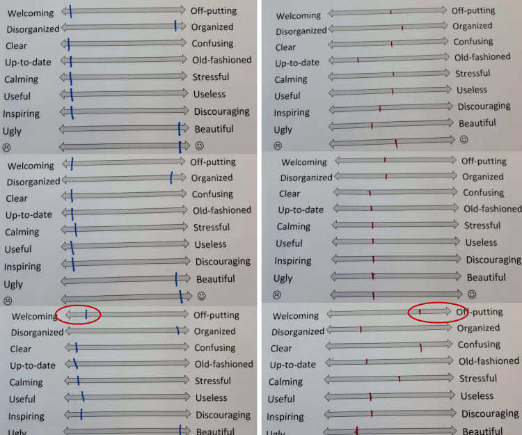
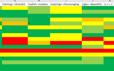
After coding, I looked at the results for the 🙂 ↔ 🙁 continuum to get a sense of the general feeling about each site. I gave them all an overall assessment (bad, ugh, meh, or ok). No site got better than ok because none was rated in the green by everyone who saw it. Then I looked at how often each was coded green, yellow, and red across all the continuums. Unsurprisingly, those results corresponded to my bad/ugh/meh/ok rating; participants’ 🙂 / 🙁 ratings had been reflective of their overall feelings. Our site ended up on the high end of “meh.” However, several participants made sure to say their ratings of our site were likely high because of familiarity, so we are really likely firmly in “meh” territory.

Now that I’d looked at the overall, I wanted to look at each of the continuums. What was our current site doing really well with? I was happy to see that our current site felt Useful and Organized to participants. “Organized” is good because it means that I feel confident about keeping the structure of the site while we change the visual design. What did we need to improve? Participants felt the site was Discouraging and Ugly. “Discouraging” is something I definitely feel motivated to fix! And “Ugly?” Well, it helps me feel better about this project to make the site beautiful. More beautiful at least.

After this, I looked at which sites did well on the aspects we needed to improve. For both the Carleton sites and the library sites, the ones felt to be most Inspiring and Beautiful were the same ones that were rated highly overall. These same sites were most felt to be Welcoming, Clear, and Calming. So these are the aspects that we’ll concentrate on most as we move through our design refresh.

Next Steps

Now, Web Committee will take a closer look at the two library sites and two Carleton sites that had the best feeling and see what specific aspects of those sites we’d like to borrow from. There’s no big time squeeze, as we’re aiming for a spring launch. Lots of time for many design-and-test iterations. I’ll report back as we move forward.

Access 2018: A UX Perspective

I started my Access 2018 conference experience with a meetup of library people interested in UX. There were only five of us, but we had good conversations about Research Ethics Boards and UX research, about being a UX team of one, and about some of the projects we’ll be working on in the coming year. We also chatted about how we would like to communicate more regularly but how difficult it can be to sustain virtual communities. (Canada is BIG. Heck, even Ontario is big.) It was nice to start off the conference with UX friends – old and new – and my focus stayed on the UX side of things throughout the conference so that’s what I want to write about here.

On Day 1, the first post-keynote presentation was all about UX. Eka Grguric talked about her experience one year in as UX Librarian at McGill. She gets brought into projects in her library as a UX consultant, and also supports others doing UX and user research in the library. She also offers training on UX research methods for interested library staff. Her work is a combination of operational and project-based. She gave a bit of detail about two projects and her monthly operational tests to give us a flavour of the range of methods and processes she uses.

Next up was Ken Fujiuchi and Joseph Riggie from Buffalo State College, who talked about Extended Reality, a combination of virtual reality, augmented reality, and mixed reality technologies. They covered a few different topics (slides here), but what stood out for me was their mention of how user experiences will change as new interfaces become possible and there are new ways for people to interact with materials. They specifically mentioned oral histories moving from audio-only files to users being able to interact with a holographic image of a person who can tell stories but also answer questions. What’s good UX for oral history holograms?

A few presentations also focused on what I see as UX for library staff. Juan Denzer spoke about a project being developed by a pair of students he’s supervising that aims to make it easier to manage EXProxy configuration files (which can easily run to thousands of lines). Having tried to troubleshoot stanzas in EXProxy myself, I can definitely see how this could improve the UX for staff. However, as one of my table mates said, adding an application to manage a text file also adds overhead for whoever has to maintain and update that application. Trade-offs!

Ruby Warren from University of Manitoba was fantastic in her description of a project that didn’t quite get off the ground in the six months she’d set aside to complete it. Ruby had seen that distance students weren’t learning how to use the library in the same way in-person students were (e.g. no in-class visits from a librarian). She wanted to find a way to teach some basic IL to these students and thought that an interactive fiction game would be a good thing to try. She had some great lessons learned (including “Don’t Do Everything in the Wrong Order” and “Plan for Apathy”). One of my favourite things about Ruby’s presentation was that she was upfront about her failures, including – as a UX person – not planning for user testing during development. It’s gutsy to get up in front of your peers and say that you forgot a basic tenet of your discipline because you were too excited about a project. So human but so hard. Yay Ruby! Another key takeaway was not underestimating appeal when planning this kind of project. As someone who has a bard time seeing the appeal of library games, I appreciated hearing this. (I believe it’s possible, but I think it’s extremely difficult.) Ruby’s slides are here.

Back to UX for staff (and users too, to some extent), Calvin Mah from Simon Fraser University spoke about his experience archiving their ILS when his library moved from Millennium to Alma. Some kinds of information were not migrated at all, but even the records that were migrated were not trusted by cataloguers; they wanted to be able to go back to the old records and compare. With these two situations – missing information plus untrusted information – it was decided to build an archival copy of the old system. I find this interesting. On the one hand, I can absolutely understand wanting to help staff feel comfortable with the new system by letting them know they still have the old information if they need it; the transition can be more gradual. But Calvin noted that even though the information is getting stale, staff are still relying on it. So perhaps it’s more of a security blanket, and that’s not good. Also, there was a good library nerd laugh when he said that some staff wanted the archival copy to behave like the old system: “Respect the 2nd indicator non-filing characters skip!”

Something I see as having both staff and user UX implications is having contract work in library systems (probably everywhere, but in systems for sure). Bobbi Fox from Harvard has been on many sides of this situation (as a contractor, as a person hiring the contractor, as a team member, as a person cleaning up after a contractor) and detailed many things to consider before, during, and after contract work in library IT. Too often, contract work results in projects that are difficult to maintain after the contractor has gone, if they are even completed at all. I really like that she specifically mentioned thinking about who is providing user support for the thing(s) the contractor is building, as separate from who is going to own/maintain the project going forward. And in talking about documentation, specifying what documentation those user support people need in order to be able to support the users. This will almost always be different documentation that what is required for maintenance. Good docs are vital for maintenance but if people can’t use the thing, there’s not much point in maintaining it!

Nearing the end of the first day was a panel: “When the Digital Divides Us: Reconciling Emerging and Emerged Technologies in Libraries” that looked at disconnects that can happen on both the staff side and the user side when libraries favour emerging (“shiny”) technology. I thought there were some great points made. Monica Rettig at Brock University talked about issues when access services staff are expected to help troubleshoot technology problems; for staff used to a transactional approach to service, with a heavy reliance on policy and procedures, there is a big cultural shift in moving to a troubleshooting approach. Rebecca Laroque from North Bay Public Library wondered about providing 3D printers while she still has users asking for classes on how to use email. Monica noted the importance of core services to users even though they’re aren’t shiny or new; she asked who will be the champion for bathrooms or printers in the library? Krista Godfrey from Memorial University asked whether library technology should be evaluate and assessed in the same way that library collections are? Lots of questions here, but definitely an agreement that a focus on core infrastructure and services may not be exciting but it’s absolutely vital.

Day 2 was a bit lighter on the UX side. Tim Ribaric gave a great presentation on RA21 and the possible implications of it replacing IP authentication for access to electronic resources in libraries. Tim is skeptical about RA21 and believes it is not good news for libraries (one of his theorems about RA21: “We are effed”). His take was very compelling, and from a UX perspective, he is not convinced there is a clear way forward for walk-in users of academic libraries (i.e. users not affiliated with the university or college) to access our subscription-based electronic resources if we move from IP authentication to RA21. I know some academic libraries explicitly exclude walk-in users, but others are mandated to provide access to the general public so we are used to providing guest access and our users are used to having it. Tim has posted his slides if you’re interested in more on this.

Another interesting UX moment was in Autumn Mayes’ lightning talk about working in Digital Scholarship and Digital Humanities. Part of her job had been working in The  Humanities Interdisciplinary Collaboration (THINC) Lab at the University of Guelph. THINC Lab is a members-only space aimed at grad students, postdocs, faculty, etc. who are doing interdisciplinary and digital humanities research. However, they also host events and programs that are open to the larger university population. So Autumn found herself having to tell non-members that they weren’t allowed to use the space, but at the same time was trying to promote events and programs to both members and non-members. She very succinctly described this as “Get out! But come back!” It’s interesting to think about spaces that are alternately exclusionary and open; what is the impact on users when you make a mostly exclusionary space occasionally welcoming? What about when a mostly welcoming space is occasionally exclusionary?

Bill Jones and Ben Rawlins from SUNY Geneseo spoke about their tool OASIS (Openly Available Sources Integrated Search), aimed at improving the discovery of Open Educational Resources (OER) for faculty at their campus and beyond. The tool allows searching and browsing of a curated collection of OER (currently over 160,000 records). It seems like a nice way to increase visibility and improve the UX of finding OER such as open textbooks.

Again in library staff UX, May Yan and MJ Suhonos from Ryerson University talked about how library-specific technologies can be difficult to use and adapt, so they decided to use WordPress as a web platform for a records management project in their library. One thing I found interesting was that the Ryerson library had a Strategic Systems Requirements Review that explicitly says that unless library-specific technology has a big value-add, the preference should be to go outside library technology for solutions. From a UX point of view, this could mean that staff spend less time fighting with clunky library software, both using it and maintaining it.

The last conference presentation of Day 2 reported on the results of UX testing of Open Badges in an institutional repository. Christie Hurrell from the University of Calgary reported that her institution uses quite a number of Open Badges. For this project, the team wondered whether having an Open Badge that demonstrated compliance with an Open Access policy would encourage faculty to deposit their work in the institutional repository. They did a survey, which didn’t show a lot of love for Open Badges in general. Then they did some user testing of their IR (DSpace), to find out whether faculty would add an Open Badge to their work if the option was there. Unfortunately, the option to add an Open Badge was completely lost in the overall process to deposit a work in the IR, which faculty found extremely time-consuming. Since faculty were frustrated with the process in general, it is very unlikely that an Open Badge would provide an incentive to use the IR again.

The conference ended with the Dave Binkley Memorial Lecture, given this year by Monique Woroniak. Monique spoke about “Doing the Work: Settle Libraries and Responsibilities in a Time of Occupation” where the Work is what non-Indigenous people and organizations need to do before trying to work with Indigenous people and organizations. She gave some clear guidelines on, essentially, how to act with empathy and these guidelines can apply to many communities. However, I definitely don’t want to “all lives matter” this. Monique was clearly speaking about Indigenous people, and specifically about her experiences with Indigenous people in Winnipeg. When she spoke of the importance of assessing our capacity before undertaking new work, she included the capacity to build respectful relationships with Indigenous people. Although it can definitely be argued that a capacity to build respectful relationships is useful for UX work, her caution to never over-promise and under-deliver when working with Indigenous people is situated in the Canadian context of settlers over-promising and under-delivering time and time and time again. Sure, we’ll respect this treaty. Sure, we’ll take care of your children. Of course we’re ready for reconciliation. Over-promising and under-delivering is never a great move, but in this context it is particularly toxic. A few other things that stood out for me in Monique’s talk:

  • Listen to the breadth of opinions in the community. Take the time.
  • This is head work and heart work, and, especially, long-haul work.
  • Look to shift the centre of power for not just the big decisions, but the small as well.

If this interest you, Monique’s talk is available to view in its entirety, as are all of the presentations at the conference (they will be split into individual videos for each talk eventually). Monique finished with a lovely quotation from Katherena Vermette‘s poem “new year’s eve 2013” from her 2018 book river woman:

truth is a seed
planted deep

if you want to get it
you have to dig

UX from a Technical Services Point of View

This the text of a presentation I did last year at the Access Conference in Regina. Emma and I had plans to write this up as a paper, but life intervened and that didn’t happen. I wanted to keep some record beyond the video of the presentation, so here it is.

This morning I’m going to talk about a user research project I did with my colleague Emma Cross. We observed the user experience of students doing academic research online and then looked at that UX from the perspective of technical services staff. I’ll start with talking about the research we did with the students, the results from that research that seemed most relevant to Technical Services staff, and then I’ll talk a bit about the reaction that Technical Services staff at Carleton had to those results.

I’m sorry that Emma can’t be here. She was the Technical Services brain behind it all; I was the user research monkey.

So, why did we want to do this? Mixing Technical Services and User Experience is not done very often. A Technical Services supervisor at Carleton told us she was finding it difficult to prioritize work for her staff, and she wanted some insight into what was likely to have the most impact for our users. Fantastic.


Methodology

Emma and I designed the research to be student-led; we didn’t have specific questions but we were interested in where students searched, how they searched, and what kinds of things they looked at in their results. In our sessions, we asked students to search for something they needed for a research assignment, and to try as much as possible to do what they would normally do, not what they thought they “should” do. We emphasized that even though we were from the library, they didn’t have to use library tools or resources if they normally wouldn’t for the kinds of searches they were doing.

I moderated the sessions, asking the students to think aloud throughout their searches, prompting them with questions if they were quiet. We let them search until they seemed to finish but let them know when we neared 30 minutes. The sessions lasted anywhere from 10-40 minutes, but most were 20-30 minutes.

Emma took notes and we also captured the sessions on video, so we were able to go back and fill in gaps when people worked too quickly for Emma to capture everything.

We did the research in March of 2017 and saw 10 undergraduate and 10 graduate students. Emma coded the results and found 4 themes that she thought were most relevant to technical services


Result #1: Overwhelming use of the single search box

Summon and/or Google Scholar were used by most of the students, and the catalogue not much at all. 7 people used various specialized databases and there was also regular Google, Wikipedia, Tumblr, but Summon and Google Scholar were really the most used.

There was little difference between grad and undergrad use of tools, except for catalogue use. The 2 people who used the catalogue were undergraduates. Kinda weird. But this is a good time to emphasize that this was a qualitative study, not a quantitative one; we’re not going to extrapolate that 20% of undergrads use the catalogue and 0 grad students do. The numbers don’t matter – it’s that when observing how students search and listening to how they approach looking for information, the library catalogue doesn’t often come up. It’s not part of their process.


Result #2: Popularity of the “get it” button  

Emma’s second theme is the logical corollary to the overwhelming use of single search: the popularity of the “Get it” button and the link resolver in general.

I love the “Get it” link – it makes my life much easier. (Graduate student)

“Get it” is really useful (Graduate student)

“Get it” is helpful!” (Undergraduate)

HEY LOOK Carleton offers to “get this” in Google scholar – HEY THAT IS GREAT! (Undergraduate)

Even when students didn’t mention it explicitly, they used it seamlessly. Maybe that seems obvious, but I have seen user research results from other university libraries where students had a hard time understanding their Get It links. Our students got “get it.”


Result #3: Metadata looked at:  title, date, abstract; Metadata searched: keyword, keyword, keyword

A pattern we saw repeated over and over in student research was:

Scanning search results list

  • Quickly reviewing title for relevant keywords
  • Check the date – majority of student not interested in old material
  • If interested, click on record to read the abstract
  • If title, date, abstract check out then download / print for further reading.

Students seem to be so used to this pattern and used to seeing abstracts or snippets of content that when they don’t see an abstract, usually when they are looking at a monograph record, they’re confused and then they move on.

And although students look at different metadata fields, they rarely search them. Aside from a couple of author searches and one really heartbreaking subject search, most of the searches we saw were keyword, keyword, keyword.


Result #4: Speed, impatience and ease of access

Students quickly skimmed results lists and rarely went beyond the first page of results (or with Summon’s infinite scroll, the first 10 or so). Undergrads tended to look at fewer results than grad students.

Many students had no qualms saying they were busy and they didn’t want to waste time. There was a general tendency to skip over materials that were harder to access – things on reserve, in storage, or borrowed, documents that take a long time to download. Even when they did pursue these harder to access items, they weren’t necessarily happy about it. This is probably Emma’s favourite quote:

This is useful IF I can find it. It is not online so I will have to search the Library itself. This makes me cry a little.

Generally, the students we saw were easily able to find other things that seemed just as good, so skipping over hard-to-access items didn’t seem to create much of a problem.


Reaction from Technical Services staff

So these were the findings we thought were most relevant to Technical Services staff. There are no big surprises here, but we wanted to know how our own Technical Services staff would react to what we’d found. What would they take from our results?

In July, we gave a presentation for Library technical services staff, followed by a discussion.

Here are some of the first comments from staff, to give you a flavor:

  • “On the library website, we now have a Summon search box instead of a catalogue search box, and maybe that’s why catalogue use was low.”
  • “Are users even aware of the catalogue?”
  • “Students don’t seem to be aware of subject headings. They should be taught about the catalogue and how to do subject searches.”
  • “Maybe all first years could be given a booklet about how to search properly.”

So that was sort of the tone at the beginning. Then our Head of Cataloguing said something like “I’m not buying into this discussion that keyword searching is a bad search. Remember that keyword searches subject. Indexing is the most important part of this.”

Then the Technical Services supervisor whose questions started the project said something like “I found the part about Summon and the link resolver very interesting. This validates where we need to spend time. We can call out vendors where there is a consistent problem. Now I can be pushy to get issues resolved. If that is what students are relying on, then we have to make sure what we have is right.”

Yes, having a Head and a Supervisor weigh in like this is bound to change the tone, but things did become much more positive and proactive from here on in, with comments and suggestions like this:

  • “I’m wondering about loading e-book records. Sometimes we have good records but they don’t have subjects. Perhaps now I can load these records as they have summaries so they would get picked up in a keyword search.”
  • “Cataloguers can change the way we work and include table of contents and summaries in monograph records when we find them. Perhaps we could make this an official policy and procedure.”
  • “Perhaps we can take more time to see how Summon pulls information and where that information is pulled from.”


Conclusion

So:

  • A move to better understand how our discovery system handles our records
  • A push to enrich print and ebook records to improve keyword searching
  • A renewed focus on making sure the knowledge base is accurate so the link resolver works

I know these aren’t necessarily ground-breaking ideas but less than an hour earlier, this same group suggested giving first year students a booklet on how to search!

Hearing that students mostly do keyword searches in Summon and Google Scholar was understandably a little threatening to staff who have a very catalogue-centric view of the library (because that’s where they spend most of their time). But very quickly, they moved on and were suggesting new ways of doing things, and new ways of thinking about their work. It was wonderful.

Technical Services and User Experience don’t usually cross over, but we saw that it can be a really good fit. Our students do their research online. Technical Services staff make decisions that affect how library resources are found online. So they are perfectly positioned to improve the user experience of our students. I’ll give the last word to one of our staff members, who after seeing our results said what I think we all want:

“Now I can attack the right problems with purpose.”

Adding Useful Friction to Library UX: Ideas from UXLibs Workshop Participants

Post-its with ideas on adding friction

At this years UXLibs conference, I led a workshop on adding useful friction to the library user experience. I’ve already posted my text of the workshop, but I told the participants that I also wanted to share the ideas that they came up with during the course of the workshop. The ideas were generated around three themes:

  • friction for users, with a goal of helping those same users
  • friction for staff, with a goal of helping users
  • friction to improve inclusion in the library

What is below is verbatim, as much as I could decipher, from the post-its. There’s seems to be a combination of examples of bad friction and ideas for good friction. If you were a participant and would like to correct or flesh out what’s here, please get in touch!

Here are all of the responses from both workshops, in no order at all:

  • Remove desk or make it a low height only
  • Lower the circulation desk or remove it altogether
  • Users: appointments (promote other options first, Books/resources)
  • Giving the article rather than showing to find the resource
  • Answer questions instead of showing how to do it
  • Wayfinding no.1 enquiry — looking at it with fresh eyes
  • Staff want to put passive aggressive posters everywhere
  • Toilet sign / Not a key — Gender N.
  • Have the students suggest furniture in the library
  • A room with a computer and a loudspeaker where the patron can hear what is on the screen
  • Clickable text where a loudspeaker symbol shows you that you can hear what is said
  • Wayfinding signage / Posters — loads of / passive aggressive
  • Enforced preview when editing web pages
  • Put forms through web group to ensure they’re not excluding
  • When they click around one website
  • When they order on shelf items
  • When they order articles
  • Making them having coffee with other departments and teaching staff
  • Making them walk across campus to use another office
  • Making them use the public spaces one hour a week
  • You haven’t used Library Search for a while – do you need some tips?
  • Get rid of printed self-help so staff have to promote online self-help
  • Friction to help people understand the space they’re in
  • Helping new users find books (when they want it!)
  • Multi-language at entrances and around
  • Remove classification systems!!
  • Inclusivity check before things are published
  • Remove search term suggestions databases
  • Remove phone, e-mail, etc. from the info desk (anything that isn’t talking to students)
  • Giving more options for reference help – all hours of the day, off campus, offline, etc.
  • Change the quiet reading rooms with the group rooms every week
  • Have staff meetings at the group study areas/rooms
  • Put the check-out machines on the top floor
  • Wary of pop ups but what if pop has the answer
  • To slow down scanning of web pages — part scan and leave just prior to achieving answer
  • Pop up box: “Sign in to get: full text, saved search, e-shelf, etc.”
  • A confirm button when adding manual charges to accounts
  • All A4H staff to be fully trained!
  • Had thought of reducing page options/text but could friction be added another way?
  • When they order interlibrary loans
  • We added friction to subj guide BUT — super friction -> no control for subj lib. Therefore like the less friction idea presented by Shelley
  • Pop up on self-issues: Your books will auto-renew for “x” weeks but may be recalled
  • Are you sure? Deleting records from Endnote web
  • EMS Editions: Removing assets
  • Exhibition gallery: interactive screen
  • Event submission
  • Feedback forms
  • Find a book / study space blindfolded?
  • Stop them from using terms and phrases that people don’t understand
  • Test all changes to web page on real users, especially extreme users
  • Plain language checkers for web content
  • Highlighting research consultations over guides + DBs
  • Declarative signage: “You are on the (blank) floor, (blank wing)”
  • Website style guides
  • Push back on academic staff to upload accessible teaching materials to VLE
  • Making ILL request — have you check whether this is in library? (?)
  • Encourage use of learning technologies, but also provide analogue alternatives
  • Provide alternative signage options (multiple alternatives)
  • When entering study zones -> be aware of conditions expected in space
  • Links that take users to Arabic page rather than going back to main page
  • Allowing males to borrow / use the library during female hours
  • Having box to return the books used inside the library
  • Having a shared online spreadsheet if they would like to have someone to cover their desk hours rather than emailing
  • Did you know? pop ups on library websites
  • iPads out intermittently to draw attention
  • Having to meet with a librarian
  • Signage (or something else!) that prompts new students to consider using Library catalogue before trawling the physical shelves
  • Helpdesk would benefit from friction when students make initial enquiries re: Learning Difference Support (e.g. Dyslexia) — In my Univ Lib they are required to ask about this in an “open” queue without any confidentiality!
  • Near shelves potential redirect to lib cat
  • On entry to help students choose appropriate working space
  • On entry think about what student intends to achieve during visit
  • Replying to email enquiry messages force scroll to beginning to force people to read whole history
  • Have you left this in required state? Bog poster for open access disabled loos
  • Creating new challenges in every day tasks to upskill staff, provide better services to users
  • Asking questions (too many!) to get essential services in place / working properly (e.g. hearing loops [or might be learning loops])
  • Forcing users to rub up against us: “This resources has been brought to you by your library”
  • (for colleagues) Flag for spamming no. of forwards and emails to lists per day
  • Returning books through the book sorter—asking “have you returned all the books you need to” before issuing a receipt
  • Students who don’t have a disability but are anxious to be able to have one-to-one library hours, therefore all need to be asked at induction
  • ILR’s (InterLibrary Requests) asking “is this available locally”
  • Items in store requested through the catalogue—”can this be accessed online” before the final request click—stops unnecessary collections from store that are not collected
  • Vendor outlinks “You are about to leave the library’s website”
  • Time to choose to read something you wouldn’t have thought of yourself
  • Time to reflect on impact of a certain behavior
  • Time to advertise additional services that might be helpful
  • Screens/maps to look at before looking for books → are you going where you want to?
  • Set target times to resolve a query. Solutions should be quick and easy.
  • Library website: design decision
  • Library website: content
  • CMAS editors: removing assets
  • ILL request form when item not available
  • Library clear link when no results on discovery layer
  • Disable possibility to take a breath from chat
  • Stricter policy for adding web pages
  • Slow down book drop
  • Friction in ordering interlibrary loans which should be purchases
  • How do we offer booking of “resource rooms”?
  • Can we make it more difficult to make web pages inaccessible?
  • Forced message to remove USB before the PC shuts down/logs you out
  • Triage questions? IT vs Library
  • Only hosting video tutorial with embedded subtitles — don’t rely on YouTube autotitles = RUBBISH!!
  • What images are you using to show your library? Does it look inclusive on posters / online / in literature? E.g. pic of our staircase
  • Reservation Collection—self-issue—extra touch screen with due date for 48 hr loans
  • Stop them from rushing to the top floor, like signs in the elevator
  • Force staff to actually test the accessibility of web sites
  • Students, faculty, other ←
  • Library VRS → stop before leaving the chat “Are you sure you don’t need further help?”
  • How do we address people / users?
  • Double-check before making a poster to “solve” a problem!
  • Role management: Design does not equal project management
  • Peer-checking of presentations / teaching sessions for accessibility
  • Writing training materials for students with English as a 2nd language
  • Uploading to online system: large files, Microsoft format, video and audio (not stream), copyrighted
  • To support distant or part-time students
  • Starting projects without: clarity about outcomes, testing, resources required
  • Adding resource e.g. reading list not using the system
  • Copying over last years materials to this years module
  • Better obstacle than fee for interlibrary loans or document delivery
  • Remove “scripts” for staff answers on Just Ask (IM) — be more personal?
  • No pictures of PDFs or text on web — screen readers can’t cope with them
  • Pop-ups letting students know access is being provided by the library (to online resources)
  • Library website
  • QR codes??
  • Symbols instead of English — Puts everyone at the same level of wayfinding regardless of language skills
  • Diverse reading lists
  • Know Your Staff Wiki!
  • Regular process to review existing web content before adding more
  • Entrance vestibule to silent study spaces
  • Promoting self-service portal at library entrance
  • Chatline. FAQs page to scroll through to get to input page
  • Force a catalogue search before submitting an ILL request
  • Policy that all staff deal with a request for help at point of need and see through
  • Logging all enquiries on an EMS
  • Pick-up shelf: Make users check out their reading room loans
  • Database records in Summon—people going straight to Lib search when not everything is listed
  • Sign up form for focus groups so we can pick by course, not first come, first served
  • Academic workbooks arranged by topic on CMS not just straight link to AS server
  • Online support and workshops more prominently promoted than 1:1s as easier to same [some?] large number
  • I need to approve all external comms and surveys
  • Web edits — I have to approve all pages
  • Training on [survey?] software linked to approval from me
  • Me as final editor for newsletter (brand / accessibility)
  • Gender neutral toilets
  • Editing text for screen readers — on all channels
  • Check catalogue for students who have incorrect info on reserve items
  • Complete a short online library quiz as part of first module
  • Activate your student card in the library within the last week of term
  • Put “Please refer to…” messages where rules aren’t clear
  • ILL — request articles/books we already have—way to make them search first?
  • Search box — choose what format first (they will type anything in a search box without thinking and then think we don’t have an article because they are looking in catalog)
  • Ebooks — add to reserves or pop up asking them to look by title
  • Student staff tell students we don’t have an item when we do — need to try other ways — have system prompt?
  • Expand chat hours so people uncomfortable approaching desk can still ask questions
  • CMS — make popup for alt-text but also color contrast, web writing, close-captioning for videos, etc.
  • Content manager for website — approve all changes even Subject Guides
  • Better feedback on item request — many are not picked up
  • Knowing who your liaison is if on a certain page
  • Staff Friction: Using CRM or equivalent to report issues to other teams, i.e. metadata errors: don’t ring team, logon LANDESK (CRM). Has advantages collating themes and work.
  • Inclusion: Feedback form gender
  • User [Gateways portals]: To prompt and remind about compliance maybe – copyright / usage — use of data/info. Authentication does this also.
  • Staff: Printing checklist Actions before resorting to use of staff printer
  • User: To prompt remind/inform resources purchased on behalf of students by institution
  • IT passwords for faculty users
  • Using lockers after library closing hours
  • Computers on every floor (staff)
  • Toilets (improve inclusion)
  • Game area (students)
  • Lounge area (students)
  • Change main structure of website
  • Adding too long text to buttons
  • Adding too many main category pages
  • Put “silence” signs on every door → there have to be noisy places
  • Just grab a book (without having a look to the books around)
  • Policy: force all staff to use structured text documents so that they are accessible
  • Self-return machines (Don’t take think books, so we need to “slow” the users know know this)
  • Inclusion: Programs → languages
  • Open access funding program → read criteria before submitting the application
  • Adding too long texts into modals designed to be glanced
  • Gender in feedback forms
  • Requirement for text and audio on video
  • Request / reservation: This book is on the shelves in this library. Are you sure you want to request it? [checkbox] Yes.
  • Sign on ground floor: The only toilets and drinking water in this building are on this floor. (Most library services are 2 floors up from here)
  • Making gender option in forms more inclusive e.g. more option or textbox
  • Before making an order/reservation that costs money
  • Before making a reservation
  • Before deleting your user account
  • Before deleting any info permanently
  • Get staff out of their offices — send them to find academic who have not been in the library for a long time
  • We have a Lib Reciprocal Programme across unis in S.A. But in our Lib we force users to see an Info Lib before they get a letter to visit another uni library.
  • Catalogue research (first finding is seldom the best)
  • Remove option to add media on webpages for most staff
  • Accessibility checks before publishing a webpage
  • Filling out book request form for somebody
  • Clearing a list in the catalog
  • Printing single vs. double sided
  • Staff designate, monitor, and enforce quiet areas
  • Building entrance vs. exit
  • Reserving lendable technology
  • Requesting items from storage
  • Information in subject guides
  • Giving information to new students about the library’s services
  • Ordering interlibrary loans
  • In the Discovery systems
  • Request print copies of articles
  • Promote new physical and online materials in entrance
  • User (student) testing before buying e-books
  • Build UX into all projects
  • Prayer facilities
  • A note on self service screen to common ?s. Really good idea.
  • Spending more time with the unfamiliar
  • Symbol sign posting
  • Meet and Greeters at front door
  • Pick up cards at library
  • Send librarians out to visit people
  • Stop “library” work at enquiry point
  • Wellbeing attention grabbing display — subject guide to
  • Registration online — pick up library card in person
  • Commuter room with lockers — charging (away from home help)
  • Auto emails for book arrivals triggered by front desk team so that we are certain it is ready on the shelf
  • Friction needed to prevent deletion of content
  • Subject guides Allow use to browse area and discover other books related to study
  • Develop electronic check lists for staff to ensure staff complete all necessary steps in a task on time and in order
  • Finding tools — Before search encourage users to reflect if using the right finding tool
  • Reading lists — Cap amount of items that can be added → “Do you really want to add this item?”
  • Self-issue machines — Add “do you want to borrow” for very short loans / high charge (had at public)
  • Modernise the till and integrate with LMS. Creates a couple of steps that slows staff and avoids mistakes on the till from “autopilot”
  • “Lost” status and “Found” status. Create pop up explaining what to do and if want to continue to avoid incorrect use.
  • Int’l students — Don’t assume that library experience of someone else is the same particularly when they have a different international experience / Encourage staff to think before assuming person is just not as smart as culture they are accustomed to.
  • Filters — Putting a [friction?] to alert people that they can expand their search to include content not available at [library] as well
  • Friction for staff: prompts to ask particular questions / edit or do something people often forget
  • When searching: “This search result is showing everything. Is that what you want?” Or “It looks like you might be searching for a journal title. Would you like to do that?”
  • Different language options — catalogue, website / signage
  • Compulsory reflection on implicit biases before finalising a form / policy / procedure / interview / process / etc….
  • Sometimes it’s good to get “lost” and find hidden spaces…
  • Have “no wifi” areas to create “switch-off” spaces…
  • Noise control — something that encourages slowing of pace / pause on entry
  • Furniture might cue quiet study vs. collaboration
  • If staff are including a gender (or other protected characteristic) question on a form, make them type their justification!
  • Supporting assistive tech (friction for staff)
  • Stop long forms with every piece of info the librarian needs to order an item
  • Shibbolth sign in from pub page — get to the right path, choose the best relationship for access
  • Group study facilities — varied tech options
  • More tailored handouts for students who have English as 2nd language or 3rd etc.
  • DVD borrowing: “Don’t forget to unlock your case!” pop-up?
  • Multimedia options for dyslexic students — on entry to library
  • Chat box help kiosk for students who feel like “imposters” (afraid to admit what they don’t know)
  • Single sign on — subject / CS team comms.
  • Consistent approach to adding info to app. Autonomy and overall framework.
  • Quizzes on VCEs at end of modules
  • Furniture — soft for de-stresses
  • Commuter students — find out what their priorities are and how this differs from other students
  • To get integrated in the education with the Library competence, so every student gets the same education (information literacy)
  • Find location in the library
  • Gender free web
  • Block them from the staff cataloguing OPAC — only use for 1 hour a day
  • Think of the people you put on the website. Still mostly young, happy users.
  • Teacher making resource lists
  • Users: Interlibrary loans
  • Pop-up help button after 3 kw searches < 1 minute
  • Discover layer: where am I searching
  • Website friction from adding content — specifically start
  • “Headlines” when coming in to the library — To show services offered that are “unknown”
  • Stacks — “Did you find out the exact location of your book?”
  • Making signs — Added friction for personnel
  • Multilingual captioning
  • Sign friction or not?
  • Faculty-librarian meeting for new faculty (in-person? why?)
  • More faculty-librarian friction
  • Leaving web presence, what about credibility? Evaluate results
  • Require AIT text on IMG upload
  • When leaving discovery tool to external site
  • Management friction
  • Default web editor template; to change, require friction
  • Consider for more friction at admin side
  • Mandatory meeting with librarian for an assignment
  • Swipe card to enter the library
  • Baby changing tables
  • Rainbow lanyards
  • Help uniforms / sashes?
  • Program friction — new program proposal
  • Signage
  • Dual monitor search comp. for info desk enquiries
  • Stop users from ordering books on shelf
  • Warning pop up !DANGER!
  • Universal design on website
  • Pause before changing your brand colors etc. to your online library interface. …consider accessibility first.
  • Pause before allowing online systems use your personal data …instead, learn what the provider will do with your data
  • Pause before composing the perfect, new metadata or information model for the new library service …instead, involve users and designers in the process
  • Shh… Quiet beyond this point