I haven’t failed, I’ve just tried a lot of ML approaches that don’t work

"nope" handpainted in white over wood

“Let’s blog every Friday,” I thought. “It’ll be great. People can see what I’m doing with ML, and it will be a useful practice for me!” And then I went through weeks on end of feeling like I had nothing to report because I was trying approach after approach to this one problem that simply didn’t work, hence not blogging. And finally realized: oh, the process is the thing to talk about…

Hi. I’m Andromeda! I am trying to make a neural net better at recognizing people in archival photos. After running a series of experiments — enough for me to have written 3,804 words of notes — I now have a neural net that is ten times worse at its task. 🎉

And now I have 3,804 words of notes to turn into a blog post (a situation which gets harder every week). So let me catch you up on the outline of the problem:

  1. Download a whole bunch of archival photos and their metadata (thanks, DPLA!)
  2. Use a face detection ML library to locate faces, crop them out, and save them in a standardized way
  3. Benchmark an off-the-shelf face recognition system to see how good it is at identifying these faces
  4. Retrain it
  5. Benchmark my new system

Step 3: profit, right? Well. Let me also catch you up on some problems along the way:

Alas, metadata

Archival photos are great because they have metadata, and metadata is like labels, and labels mean you can do supervised learning, right?

Well….

Is he “Du Bois, W. E. B. (William Edward Burghardt), 1868-1963” or “Du Bois, W. E. B. (William Edward Burghardt) 1868-1963” or “Du Bois, W. E. B. (William Edward Burghardt)” or “W.E.B. Du Bois”? I mean, these are all options. People have used a lot of different metadata practices at different institutions and in different times. But I’m going to confuse the poor computer if I imply to it that all these photos of the same person are photos of different people. (I have gone through several attempts to resolve this computationally without needing to do everything by hand, with only modest success.)

What about “Photographs”? That appears in the list of subject labels for lots of things in my data set. “Photographs” is a person, right? I ended up pulling in an entire other ML component here — spaCy, to do some natural language processing to at least guess which lines are probably names, so I can clear the rest of them out of my way. But spaCy only has ~90% accuracy on personal names anyway and, guess what, because everything is terrible, in predictable ways, it has no idea “Kweisi Mfume” is a person.

Is a person who appears in the photo guaranteed to be a person who appears in the photo? Nope.

Is a person who appears in the metadata guaranteed to be a person who appears in the photo? Also nope! Often they’re a photographer or other creator. Sometimes they are the subject of the depicted event, but not themselves in the photo. (spaCy will happily tell you that there’s personal name content in something like “Martin Luther King Day”, but MLK is unlikely to appear in a photo of an MLK day event.)

Oh dear, linear algebra

OK but let’s imagine for the sake of argument that we live in a perfect world where the metadata is exactly what we need — no more, no less — and its formatting is perfectly consistent. 🦄

Here you are, in this perfect world, confronted with a photo that contains two people and has two names. How do you like them apples?

I spent more time than I care to admit trying to figure this out. Can I bootstrap from photos that have one person and one name — identify those, subtract them out of photos of two people, go from there? (Not reliably — there’s a lot of data I never reach that way — and it’s horribly inefficient.)

Can I do something extremely clever with matrix multiplication? Like…once I generate vector space embeddings of all the photos, can I do some sort of like dot-product thing across all of my photos, or big batches of them, and correlate the closest-match photos with overlaps in metadata? Not only is this a process which begs the question — I’d have to do that with the ML system I have not yet optimized for archival photo recognition, thus possibly just baking bad data in — but have I mentioned I have taken exactly one linear algebra class, which I didn’t really grasp, in 1995?

What if I train yet another ML system to do some kind of k-means clustering on the embeddings? This is both a promising approach and some really first-rate yak-shaving, combining all the question-begging concerns of the previous paragraph with all the crystalline clarity of black box ML.

Possibly at this point it would have been faster to tag them all by hand, but that would be admitting defeat. Also I don’t have a research assistant, which, let’s be honest, is the person who would usually be doing this actual work. I do have a 14-year-old and I am strongly considering paying her to do it for me, but to facilitate that I’d have to actually build a web interface and probably learn more about AWS, and the prospect of reading AWS documentation has a bracing way of reminding me of all of the more delightful and engaging elements of my todo list, like calling some people on the actual telephone to sort out however they’ve screwed up some health insurance billing.

Nowhere to go but up

Despite all of that, I did actually get all the way through the 5 steps above. I have a truly, spectacularly terrible neural net. Go me! But at a thousand-plus words, perhaps I should leave that story for next week….

this time: speaking about machine learning

No tech blogging this week because most of my time was taken up with telling people about ML instead!

One talk for an internal Harvard audience, “Alice in Dataland”, where I explained some of the basics of neural nets and walked people through the stories I found through visualizing HAMLET data.

One talk for the NISO plus conference, “Discoverability in an AI World”, about ways libraries and other cultural heritage institutions are using AI both to enhance traditional discovery interfaces and provide new ones. This was recorded today but will be played at the conference on the 23rd, so there’s still time to register if you want to see it! NISO Plus will also include a session on AI, metadata, and bias featuring Dominique Luster, who gave one of my favorite code4lib talks, and one on AI and copyright featuring one of my go-to JD/MLSes, Nancy Sims.

And I’m prepping for an upcoming talk that has not yet been formally announced.

Which is to say, I guess, I have a lot of talks about AI and cultural heritage in my back pocket, if you were looking for someone to speak about that 😉

archival face recognition for fun and nonprofit

In 2019, Dominique Luster gave a super good Code4Lib talk about applying AI to metadata for the Charles “Teenie” Harris collection at the Carnegie Museum of Art — more than 70,000 photographs of Black life in Pittsburgh. They experimented with solutions to various metadata problems, but the one that’s stuck in my head since 2019 is the face recognition one. It sure would be cool if you could throw AI at your digitized archival photos to find all the instances of the same person, right? Or automatically label them, given that any of them are labeled correctly?

Sadly, because we cannot have nice things, the data sets used for pretrained face recognition embeddings are things like lots of modern photos of celebrities, a corpus which wildly underrepresents 1) archival photos and 2) Black people. So the results of the face recognition process are not all that great.

I have some extremely technical ideas for how to improve this — ideas which, weirdly, some computer science PhDs I’ve spoken with haven’t seen in the field. So I would like to experiment with them. But I must first invent the universe set up a data processing pipeline.

Three steps here:

  1. Fetch archival photographs;
  2. Do face detection (draw bounding boxes around faces and crop them out for use in the next step);
  3. Do face recognition.

For step 1, I’m using DPLA, which has a super straightforward and well-documented API and an easy-to-use Python wrapper (which, despite not having been updated in a while, works just fine with Python 3.6, the latest version compatible with some of my dependencies).

For step 2, I’m using mtcnn, because I’ve been following this tutorial.

For step 3, face recognition, I’m using the steps in the same tutorial, but purely for proof-of-concept — the results are garbage because archival photos from mid-century don’t actually look anything like modern-day celebrities. (Neural net: “I have 6% confidence this is Stevie Wonder!” How nice for you.) Clearly I’m going to need to build my own corpus of people, which I have a plan for (i.e. I spent some quality time thinking about numpy) but haven’t yet implemented.

So far the gotchas have been:

Gotcha 1: If you fetch a page from the API and assume you can treat its contents as an image, you will be sad. You have to treat them as a raw data stream and interpret that as an image, thusly:

from PIL import Image
import requests

response = requests.get(url, stream=True)
response.raw.decode_content = True
data = requests.get(url).content
Image.open(io.BytesIO(data))

This code is, of course, hilariously lacking in error handling, despite fetching content from a cesspool of untrustworthiness, aka the internet. It’s a first draft.

Gotcha 2: You see code snippets to convert images to pixel arrays (suitable for AI ingestion) that look kinda like this: np.array(image).astype('uint8'). Except they say astype('float32') instead of astype('uint32'). I got a creepy photonegative effect when I used floats.

Gotcha 3: Although PIL was happy to manipulate the .pngs fetched from the API, it was not happy to write them to disk; I needed to convert formats first (image.convert('RGB')).

Gotcha 4: The suggested keras_vggface library doesn’t have a Pipfile or requirements.txt, so I had to manually install keras and tensorflow. Luckily the setup.py documented the correct versions. Sadly the tensorflow version is only compatible with python up to 3.6 (hence the comment about DPyLA compatibility above). I don’t love this, but it got me up and running, and it seems like an easy enough part of the pipeline to rip out and replace if it’s bugging me too much.

The plan from here, not entirely in order, subject to change as I don’t entirely know what I’m doing until after I’ve done it:

  • Build my own corpus of identified people
    • This means the numpy thoughts, above
    • It also means spending more quality time with the API to see if I can automatically apply names from photo metadata rather than having to spend too much of my own time manually labeling the corpus
  • Decide how much metadata I need to pull down in my data pipeline and how to store it
  • Figure out some kind of benchmark and measure it
  • Try out my idea for improving recognition accuracy
  • Benchmark again
  • Hopefully celebrate awesomeness

sequence models of language: slightly irksome

Not much AI blogging this week because I have been buried in adulting all week, which hasn’t left much time for machine learning. Sadface.

However, I’m in the last week of the last deeplearning.ai course! (Well. Of the deeplearning.ai sequence that existed when I started, anyway. They’ve since added an NLP course and a GANs course, so I’ll have to think about whether I want to take those too, but at the moment I’m leaning toward a break from the formal structure in order to give myself more time for project-based learning.) This one is on sequence models (i.e. “the data comes in as a stream, like music or language”) and machine translation (“what if we also want our output to be a stream, because we are going from a sentence to a sentence, and not from a sentence to a single output as in, say, sentiment analysis”).

And I have to say, as a former language teacher, I’m slightly irked.

Because the way the models work is — OK, consume your input sentence one token at a time, with some sort of memory that allows you to keep track of prior tokens in processing current ones (so far, so okay). And then for your output — spit out a few most-likely candidate tokens for the first output term, and then consider your options for the second term and pick your most-likely two-token pairs, and then consider all the ways your third term could combine with those pairs and pick your most likely three-token sequences, et cetera, continue until done.

And that is…not how language works?

Look at Cicero, presuming upon your patience as he cascades through clause after clause which hang together in parallel but are not resolved until finally, at the end, a verb. The sentence’s full range of meanings doesn’t collapse until that verb at the end, which means you cannot be certain if you move one token at a time; you need to reconsider the end in light of the beginning. But, at the same time, that ending token is not equally presaged by all former tokens. It is a verb, it has a subject, and when we reached that subject, likely near the beginning of the sentence, helpfully (in Latin) identified by the nominative case, we already knew something about the verb — a fact we retained all the way until the end. And on our way there, perhaps we tied off clause after clause, chunking them into neat little packages, but none of them nearly so relevant to the verb — perhaps in fact none of them really tied to the verb at all, because they’re illuminating some noun we met along the way. Pronouns, pointing at nouns. Adjectives, pointing at nouns. Nouns, suspended with verbs like a mobile, hanging above and below, subject and object. Adverbs, keeping company only with verbs and each other.

There’s so much data in the sentence about which word informs which that the beam model casually discards. Wasteful. And forcing the model to reinvent all these things we already knew — to allocate some of its neural space to re-engineering things we could have told it from the beginning.

Clearly I need to get my hands on more modern language models (a bizarre sentence since this class is all of 3 years old, but the field moves that fast).

Adapting Coursera’s neural style transfer code to localhost

Last time, when making cats from the void, I promised that I’d discuss how I adapted the neural style transfer code from Coursera’s Convolutional Neural Networks course to run on localhost. Here you go!

Step 1: First, of course, download (as python) the script. You’ll also need the nst_utils.py file, which you can access via File > Open.

Step 2: While the Coursera file is in .py format, it’s iPython in its heart of hearts. So I opened a new file and started copying over the bits I actually needed, reading them as I went to be sure I understood how they all fit together. Along the way I also organized them into functions, to clarify where each responsibility happened and give it a name. The goal here was ultimately to get something I could run at the command line via python dpla_cats.py, so that I could find out where it blew up in step 3.

Step 3: Time to install dependencies. I promptly made a pipenv and, in running the code and finding what ImportErrors showed up, discovered what I needed to have installed: scipy, pillow, imageio, tensorflow. Whatever available versions of the former three worked, but for tensorflow I pinned to the version used in Coursera — 1.2.1 — because there are major breaking API changes with the current (2.x) versions.

This turned out to be a bummer, because tensorflow promptly threw warnings that it could be much faster on my system if I compiled it with various flags my computer supports. OK, so I looked up the docs for doing that, which said I needed bazel/bazelisk — but of course I needed a paleolithic version of that for tensorflow 1.2.1 compat, so it was irritating to install — and then running that failed because it needed a version of Java old enough that I didn’t have it, and at that point I gave up because I have better things to do than installing quasi-EOLed Java versions. Updating the code to be compatible with the latest tensorflow version and compiling an optimized version of that would clearly be the right answer, but also it would have been work and I wanted messed-up cat pictures now.

(As for the rest of my dependencies, I ended up with scipy==1.5.4, pillow==8.0.1, and imageio==2.9.0, and then whatever sub-dependencies pipenv installed. Just in case the latest versions don’t work by the time you read this. 🙂

At this point I had achieved goal 1, aka “getting anything to run at all”.

Step 4: I realized that, honestly, almost everything in nst_utils wanted to be an ImageUtility, which was initialized with metadata about the content and style files (height, width, channels, paths), and carried the globals (shudder) originally in nst_utils as class data. This meant that my new dpla_cats script only had to import ImageUtility rather than * (from X import * is, of course, deeply unnerving), and that utility could pingpong around knowing how to do the things it knew how to do, whenever I needed to interact with image-y functions (like creating a generated image or saving outputs) rather than neural-net-ish stuff. Everything in nst_utils that properly belonged in an ImageUtility got moved, step by step, into that class; I think one or two functions remained, and they got moved into the main script.

Step 5: Ughhh, scope. The notebook plays fast and loose with scope; the raw python script is, rightly, not so forgiving. But that meant I had to think about what got defined at what level, what got passed around in an argument, what order things happened in, et cetera. I’m not happy with the result — there’s a lot of stuff that will fail with minor edits — but it works. Scope errors will announce themselves pretty loudly with exceptions; it’s just nice to know you’re going to run into them.

Step 5a: You have to initialize the Adam optimizer before you run sess.run(tf.global_variables_initializer()). (Thanks, StackOverflow!) The error message if you don’t is maddeningly unhelpful. (FailedPreconditionError, I mean, what.)

Step 6: argparse! I spent some quality time reading this neural style implementation early on and thought, gosh, that’s argparse-heavy. Then I found myself wanting to kick off a whole bunch of different script runs to do their thing overnight investigating multiple hypotheses and discovered how very much I wanted there to be command-line arguments, so I could configure all the different things I wanted to try right there and leave it alone. Aw yeah. I’ve ended up with the following:

parser.add_argument('--content', required=True)
parser.add_argument('--style', required=True)
parser.add_argument('--iterations', default=400)        # was 200
parser.add_argument('--learning_rate', default=3.0)     # was 2.0
parser.add_argument('--layer_weights', nargs=5, default=[0.2,0.2,0.2,0.2,0.2])
parser.add_argument('--run_until_steady', default=False)
parser.add_argument('--noisy_start', default=True)

content is the path to the content image; style is the path to the style image; iterations and learning_rate are the usual; layer_weights is the value of STYLE_LAYERS in the original code, i.e. how much to weight each layer; run_until_steady is a bad API because it means to ignore the value of the iterations parameter and instead run until there is no longer significant change in cost; and noisy_start is whether to use the content image plus static as the first input or just the plain content image.

I can definitely see adding more command line flags if I were going to be spending a lot of time with this code. (For instance, a layer_names parameter that adjusted what STYLE_LAYERS considered could be fun! Or making “significant change in cost” be a user-supplied rather than hardcoded parameter!)

Step 6a: Correspondingly, I configured the output filenames to record some of the metadata used to create the image (content, style, layer_weights), to make it easier to keep track of which images came from which script runs.

Stuff I haven’t done but it might be great:

Updating tensorflow, per above, and recompiling it. The slowness is acceptable — I can run quite a few trials on my 2015 MacBook overnight — but it would get frustrating if I were doing a lot of this.

Supporting both num_iterations and run_until_steady means my iterator inside the model_nn function is kind of a mess right now. I think they’re itching to be two very thin subclasses of a superclass that knows all the things about neural net training, with the subclass just handling the iterator, but I didn’t spend a lot of time thinking about this.

Reshaping input files. Right now it needs both input files to be the same dimensions. Maybe it would be cool if it didn’t need that.

Trying different pretrained models! It would be easy to pass a different arg to load_vgg_model. It would subsequently be annoying to make sure that STYLE_LAYERS worked — the available layer names would be different, and load_vgg_model makes a lot of assumptions about how that model is shaped.

As your reward for reading this post, you get another cat image! A friend commented that a thing he dislikes about neural style transfer is that it’s allergic to whitespace; it wants to paint everything with a texture. This makes sense — it sees subtle variations within that whitespace and it tries to make them conform to patterns of variation it knows. This is why I ended up with the noisy_start flag; I wondered what would happen if I didn’t add the static to the initial image, so that the original negative space stayed more negative-spacey.

This, as you can probably tell, uses the Harlem renaissance style image.

It’s still allergic to negative space — even without the generated static there are variations in pixel color in the original — but they are much subtler, so instead of saying “maybe what I see is coiled hair?” it says “big open blue patches; we like those”. But the semantics of the original image are more in place — the kittens more kitteny, the card more readable — even though the whole image has been pushed more to colorblocks and bold lines.

I find I like the results better without the static — even though the cost function is larger, and thus in a sense the algorithm is less successful. Look, one more.

Superhero!

Dear Internet, merry Christmas; my robot made you cats from the void

Recently I learned how neural style transfer works. I wanted to be able to play with it more and gain some insights, so I adapted the Coursera notebook code to something that works on localhost (more on that in a later post), found myself a nice historical cat image via DPLA, and started mashing it up with all manner of images of varying styles culled from DPLA’s list of primary source sets. (It really helped me that these display images were already curated for looking cool, and cropped to uniform size!)

These sweet babies do not know what is about to happen to them.

Let’s get started, shall we?

Style image from the Fake News in the 1890s: Yellow Journalism primary source set.

I really love how this one turned out. It’s pulled the blue and yellow colors, and the concerned face of the lower kitten was a perfect match for the expression on the right-hand muckraker. The lines of the card have taken on the precise quality of those in the cartoon — strong outlines and textured interiors. “Merry Christmas” the bird waves, like an eager newsboy.

Style image from the Food and Social Justice exhibit.

This is one of the first ones I made, and I was delighted by how it learned the square-iness of its style image. Everything is more snapped to a grid. The colors are bolder, too, cueing off of that dominant yellow. The Christmas banner remains almost readable and somehow heraldic.

Style image from the Truth, Justice, and the American Way primary source set.

How about Christmas of Steel? These kittens have broadly retained their shape (perhaps as the figures in the comic book foreground have organic detail?), but the background holly is more polygon-esque. The colors have been nudged toward primary, and the static of the background has taken on a swirl of dynamic motion lines.

Style image from the Visual Art During the Harlem Renaissance primary source set.

How about starting with something boldly colored and almost abstract? Why look: the kittens have learned a world of black and white and blue, with the background transformed into that stippled texture it picked up from the hair. The holly has gone more colorblocky and the lines bolder.

Style image from the Treaty of Versailles and the End of World War I primary source set.

This one learned its style so aptly that I couldn’t actually tell where the boundary between the second and third images was when I was placing that equals sign. The soft pencil lines, the vertical textures of shadows and jail bars, the fact that all the colors in the world are black and white and orange (the latter mostly in the middle) — these kittens are positively melting before the force of Wilsonian propaganda. Imagine them in the Hall of Mirrors, drowning in gold and reflecting back at you dozens of times, for full nightmare effect.

Style image from the Victorian Era primary source set.

Shall we step back a few decades to something slightly more calming? These kittens have learned to take on soft lines and swathes of pale pink. The holly is perfectly happy to conform itself to the texture of these New England trees. The dark space behind the kittens wonders if, perhaps, it is meant to be lapels.

I totally can’t remember how I found this cropped version of US food propaganda.

And now for kittens from the void.

Brown, it has learned. The world is brown. The space behind the kittens is brown. Those dark stripes were helpfully already brown. The eyes were brown. Perhaps they can be the same brown, a hole dropped through kitten-space.

I thought this was honestly pretty creepy, and I wondered if rerunning the process with different layer weights might help. Each layer of the neural net notices different sorts of things about its image; it starts with simpler things (colors, straight lines), moves through compositions of those (textures, basic shapes), and builds its way up to entire features (faces). The style transfer algorithm looks at each of those layers and applies some of its knowledge to the generated image. So I thought, what if I change the weights? The initial algorithm weights each of five layers equally; I reran it weighted toward the middle layers and entirely ignoring the first layer, in hopes that it would learn a little less about gaping voids of brown.

Same thing, less void.

This worked! There’s still a lot of brown, but the kitten’s eye is at least separate from its facial markings. My daughter was also delighted by how both of these images want to be letters; there are lots of letter-ish shapes strewn throughout, particularly on the horizontal line that used to be the edge of a planter, between the lower cat and the demon holly.

So there you go, internet; some Christmas cards from the nightmare realm. May 2021 bring fewer nightmares to us all.

this week in my AI

After visualizing a whole bunch of theses and learning about neural style transfer and flinging myself at t-SNE I feel like I should have something meaty this week but they can’t all be those weeks, I guess. Still, I’m trying to hold myself to Friday AI blogging, so here are some work notes:

  • Finished course 4 of the deeplearning.ai sequence. Yay! The facial recognition assignment is kind of buggy and poorly documented and I felt creepy for learning it in the first place, but I’m glad to have finished. Only one more course to go! It’s a 3-week course, so if I’m particularly aggressive I might be able to get it all done by year’s end.
  • Tried making a 3d version of last week’s visualization — several people had asked — but it turned out to not really add anything. Oh well.
  • Been thinking about Charlie Harper’s talk at SWiB this year, Generating metadata subject labels with Doc2Vec and DBPedia. This talk really grabbed me because he started with the exact same questions and challenges as HAMLET — seriously, the first seven and a half minutes of this talk could be the first seven and a half minutes of a talk on HAMLET, essentially verbatim — but took it off in a totally different direction (assigning subject labels). I have lots of ideas about where one might go with this but right now they are all sparkling Voronoi diagrams in my head and that’s not a language I can readily communicate.
  • All done with the second iteration of my AI for librarians course. There were some really good final projects this term. Yay, students!

Though these be matrices, yet there is method in them.

When I first trained a neural net on 43,331 theses to make HAMLET, one of the things I most wanted to do is be able to visualize them. If word2vec places documents ‘near’ each other in some kind of inferred conceptual space, we should be able to see some kind of map of them, yes? Even if I don’t actually know what I’m doing?

Turns out: yes. And it’s even better than I’d imagined.

43,331 graduate theses, arranged by their conceptual similarity.

Let me take you on a tour!

Region 1 is biochemistry. The red dots are biology; the orange ones, chemistry. Theses here include Positional cloning and characterization of the mouse pudgy locus and Biosynthetic engineering for the assembly of better drugs. If you look closely, you will see a handful of dots in different colors, like a buttery yellow. This color is electrical engineering & computer science, and its dots in this region include Computational regulatory genomics : motifs, networks, and dynamics — that is to say, a computational biology thesis that happens to have been housed in computation rather than biology.

The green south of Region 2 is physics. But you will note a bit of orange here. Yes, that’s chemistry again; for example, Dynamic nuclear polarization of amorphous and crystalline small molecules. If (like me), you almost majored in chemistry and realized only your senior year that the only chemistry classes that interested you were the ones that were secretly physics…this is your happy place. In fact, most of the theses here concern nuclear magnetic resonance applications.

Region 3 has a striking vertical green stripe which turns out to be the nuclear engineering department. But you’ll see some orange streaks curling around it like fingers, almost suggesting three-dimensional depth. I point this out as a reminder that the original neural net embeds these 43,331 documents in a 52-dimensional space; I have projected that down to 2 dimensions because I don’t know about you but I find 52 dimensions somewhat challenging to visualize. However — just as objects may overlap in a 2-dimensional photo even when they are quite distant in 3-dimensional space — dots that are close together in this projection may be quite far apart in reality. Trust the overall structure more than each individual element. The map is not the territory.

That little yellow thumb by Region 4 is mathematics, now a tiny appendage off of the giant discipline it spawned — our old friend buttery yellow, aka electrical engineering & computer science. If you zoom in enough you find EECS absolutely everywhere, applied to all manner of disciplines (as above with biology), but the bulk of it — including the quintessential parts, like compilers — is right here.

Dramatically red Region 5, clustered together tightly and at the far end, is architecture. This is a renowned department (it graduated I.M. Pei!), but definitely a different sort of creature than most of MIT, so it makes sense that it’s at one extreme of the map. That said, the other two programs in its school — Urban Studies & Planning and Media Arts & Sciences — are just to its north.

Region 6 — tiny, yellow, and pale; you may have missed it at first glance — is linguistics island, housing theses such as Topics in the stress and syntax of words. You see how there are also a handful of red dots on this island? They are Brain & Cognitive Science theses — and in particular, ones that are secretly linguistics, like Intonational phrasing in language production and comprehension. Similarly — although at MIT it is not the department of linguistics, but the department of linguistics & philosophy — the philosophy papers are elsewhere. (A few of the very most abstract ones are hanging out near math.)

And what about Region 7, the stingray swimming vigorously away from everything else? I spent a long time looking at this and not seeing a pattern. You can tell there’s a lot of colors (departments) there, randomly assorted; even looking at individual titles I couldn’t see anything. Only when I looked at the original documents did I realize that this is the island of terrible OCR. Almost everything here is an older thesis, with low-quality printing or even typewriting, often in a regrettable font, maybe with the reverse side of the page showing through. (A randomly chosen example; pdf download.)

A good reminder of the importance of high-quality digitization labor. A heartbreaking example of the things we throw away when we make paper the archival format for born-digital items. And also a technical inspiration — look how much vector space we’ve had to carve out to make room for these! the poor neural net, trying desperately to find signal in the noise, needing all this space to do it. I’m tempted to throw out the entire leftmost quarter of this graph, rerun the 2d projection, and see what I get — would we be better able to see the structures in the high-quality data if they had room to breathe? And were I to rerun the entire neural net training process again, I’d want to include some sort of threshhold score for OCR quality. It would be a shame to throw things away — especially since they will be a nonrandom sample, mostly older theses — but I have already had to throw away things I could not OCR at all in an earlier pass, and, again, I suspect the neural net would do a better job organizing the high-quality documents if it could use the whole vector space to spread them out, rather than needing some of it to encode the information “this is terrible OCR and must be kept away from its fellows”.


Clearly I need to share the technical details of how I did this, but this post is already too long, so maybe next week. tl;dr I reached out to Matt Miller after reading his cool post on vectorizing the DPLA and he tipped me off to UMAP and here we are — thanks, Matt!

And just as clearly you want to play with this too, right? Well, it’s super not ready to be integrated into HAMLET due to any number of usability issues but if you promise to forgive me those — have fun. You see how when you hover over a dot you get a label with the format 1721.1-X.txt? It corresponds to a URL of the format https://hamlet.andromedayelton.com/similar_to/X. Go play :).

Of such stuff are (deep)dreams made: convolutional networks and neural style transfer

Skipped FridAI blogging last week because of Thanksgiving, but let’s get back on it! Top-of-mind today are the firing of AI queen Timnit Gebru (letter of support here) and a couple of grant applications that I’m actually eligible for (this is rare for me! I typically need things for which I can apply in my individual capacity, so it’s always heartening when they exist — wish me luck).

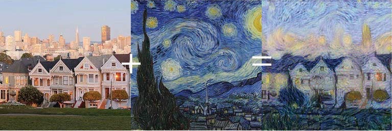
But for blogging today, I’m gonna talk about neural style transfer, because it’s cool as hell. I started my ML-learning journey on Coursera’s intro ML class and have been continuing with their deeplearning.ai sequence; I’m on course 4 of 5 there, so I’ve just gotten to neural style transfer. This is the thing where a neural net outputs the content of one picture in the style of another:

Via https://medium.com/@build_it_for_fun/neural-style-transfer-with-swift-for-tensorflow-b8544105b854.

OK, so! Let me explain while it’s still fresh.

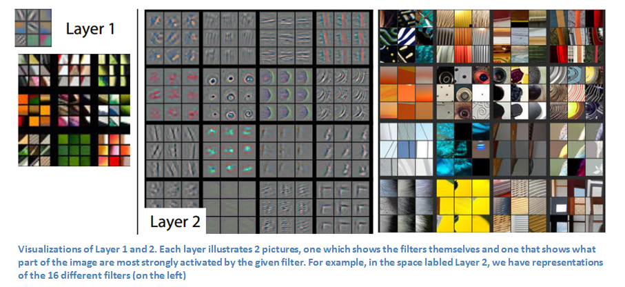
If you have a neural net trained on images, it turns out that each layer is responsible for recognizing different, and progressively more complicated, things. The specifics vary by neural net and data set, but you might find that the first layer gets excited about straight lines and colors; the second about curves and simple textures (like stripes) that can be readily composed from straight lines; the third about complex textures and simple objects (e.g. wheels, which are honestly just fancy circles); and so on, until the final layers recognize complex whole objects. You can interrogate this by feeding different images into the neural net and seeing which ones trigger the highest activation in different neurons. Below, each 3×3 grid represents the most exciting images for a particular neuron. You can see that in this network, there are Layer 1 neurons excited about colors (green, orange), and about lines of particular angles that form boundaries between dark and colored space. In Layer 2, these get built together like tiny image legos; now we have neurons excited about simple textures such as vertical stripes, concentric circles, and right angles.

Via https://adeshpande3.github.io/The-9-Deep-Learning-Papers-You-Need-To-Know-About.html, originally from Zeller & Fergus, Visualizing and Understanding Convolutional Networks

So how do we get from here to neural style transfer? We need to extract information about the content of one image, and the style of another, in order to make a third image that approximates both of them. As you already expect if you have done a little machine learning, that means that we need to write cost functions that mean “how close is this image to the desired content?” and “how close is this image to the desired style?” And then there’s a wrinkle that I haven’t fully understood, which is that we don’t actually evaluate these cost functions (necessarily) against the outputs of the neural net; we actually compare the activations of the neurons, as they react to different images — and not necessarily from the final layer! In fact, choice of layer is a hyperparameter we can vary (I super look forward to playing with this on the Coursera assignment and thereby getting some intuition).

So how do we write those cost functions? The content one is straightforward: if two images have the same content, they should yield the same activations. The greater the differences, the greater the cost (specifically via a squared error function that, again, you may have guessed if you’ve done some machine learning).

The style one is beautifully sneaky; it’s a measure of the difference in correlation between activations across channels. What does that mean in English? Well, let’s look at the van Gogh painting, above. If an edge detector is firing (a boundary between colors), then a swirliness detector is probably also firing, because all the lines are curves — that’s characteristic of van Gogh’s style in this painting. On the other hand, if a yellowness detector is firing, a blueness detector may or may not be (sometimes we have tight parallel yellow and blue lines, but sometimes yellow is in the middle of a large yellow region). Style transfer posits that artistic style lies in the correlations between different features. See? Sneaky. And elegant.

Finally, for the style-transferred output, you need to generate an image that does as well as possible on both cost functions simultaneously — getting as close to the content as it can without unduly sacrificing the style, and vice versa.

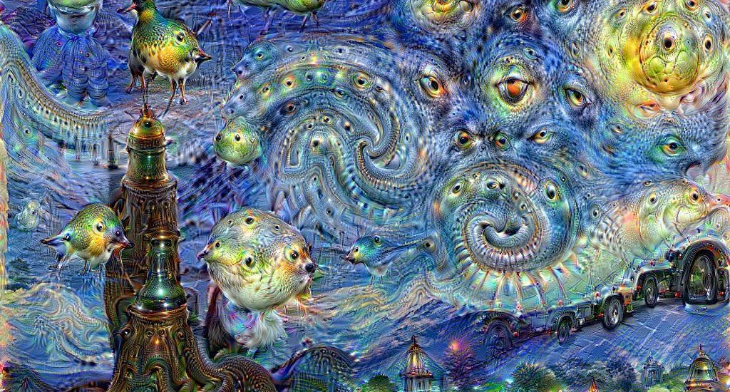
As a side note, I think I now understand why DeepDream is fixated on a really rather alarming number of eyes. Since the layer choice is a hyperparameter, I hypothesize that choosing too deep a layer — one that’s started to find complex features rather than mere textures and shapes — will communicate to the system, yes, what I truly want is for you to paint this image as if those complex features are matters of genuine stylistic significance. And, of course, eyes are simple enough shapes to be recognized relatively early (not very different from concentric circles), yet ubiquitous in image data sets. So…this is what you wanted, right? the eager robot helpfully offers.

https://www.ucreative.com/inspiration/google-deep-dream-is-the-trippiest-thing-in-the-internet/

I’m going to have fun figuring out what the right layer hyperparameter is for the Coursera assignment, but I’m going to have so much more fun figuring out the wrong ones.

Let’s visualize some HAMLET data! Or, d3 and t-SNE for the lols.

In 2017, I trained a neural net on ~44K graduate theses using the Doc2Vec algorithm, in hopes that doing so would provide a backend that could support novel and delightful discovery mechanisms for unique library content. The result, HAMLET, worked better than I hoped; it not only pulls together related works from different departments (thus enabling discovery that can’t be supported with existing metadata), but it does a spirited job on documents whose topics are poorly represented in my initial data set (e.g. when given a fiction sample it finds theses from programs like media studies, even though there are few humanities theses in the data set).

That said, there are a bunch of exploratory tools I’ve had in my head ever since 2017 that I’ve not gotten around to implementing. But here, in the spirit of tossing out things that don’t bring me joy (like 2020) and keeping those that do, I’m gonna make some data viz!

There are only two challenges with this:

  1. By default Doc2Vec embeds content in a 100-dimensional space, which is kind of hard to visualize. I need to project that down to 2 or 3 dimensions. I don’t actually know anything about dimensionality reduction techniques, other than that they exist.
  2. I also don’t know know JavaScript much beyond a copy-paste level. I definitely don’t know d3, or indeed the pros and cons of various visualization libraries. Also art. Or, like, all that stuff in Tufte’s book, which I bounced off of.

(But aside from that, Mr. Lincoln, how was the play?)

I decided I should start with the pages that display the theses most similar to a given thesis (shout-out to Jeremy Brown, startup founder par excellence) rather than with my ideas for visualizing the whole collection, because I’ll only need to plot ten or so points instead of 44K. This will make it easier for me to tell visually if I’m on the right track and should let me skip dealing with performance issues for now. On the down side, it means I may need to throw out any code I write at this stage when I’m working on the next one. 🤷‍♀️

And I now have a visualization on localhost! Which you can’t see because I don’t trust it yet. But here are the problems I’ve solved thus far:

  1. It’s hard to copy-paste d3 examples on the internet. d3’s been around for long enough there’s substantial content about different versions, so you have to double-check. But also most of the examples are live code notebooks on Observable, which is a wicked cool service but not the same environment as a web page! If you just copy-paste from there you will have things that don’t work due to invisible environment differences and then you will be sad. 😢 I got tipped off to this by Mollie Marie Pettit’s great Your First d3 Scatterplot notebook, which both names the phenomenon and provides two versions of the code (the live-editable version and the one you can actually copy/paste into your editor).
  2. If you start googling for dimensionality reduction techniques you will mostly find people saying “use t-SNE”, but t-SNE is a lying liar who lies. Mind you, it’s what I’m using right now because it’s so well-documented it was the easiest thing to set up. (This is why I said above that I don’t trust my viz.) But it produces different results for the same data on different pageloads (obviously different, so no one looking at the page will trust it either), and it’s not doing a good job preserving the distances I care about. (I accept that anything projecting from 100d down to 2d will need to distort distances, but I want to adequately preserve meaning — I want the visualization to not just look pretty but to give people an intellectually honest insight into the data — and I’m not there yet.)

Conveniently this is not my first time at the software engineering rodeo, so I encapsulated my dimensionality reduction strategy inside a function, and I can swap it out for whatever I like without needing to rewrite the d3 as long as I return the same data structure.

So that’s my next goal — try out UMAP (hat tip to Matt Miller for suggesting that to me), try out PCA, fiddle some parameters, try feeding it just the data I want to visualize vs larger neighborhoods, see if I’m happier with what I get. UMAP in particular alleges itself to be fast with large data sets, so if I can get it working here I should be able to leverage that knowledge for my ideas for visualizing the whole thing.

Onward, upward, et cetera. 🎉